Spring Switch
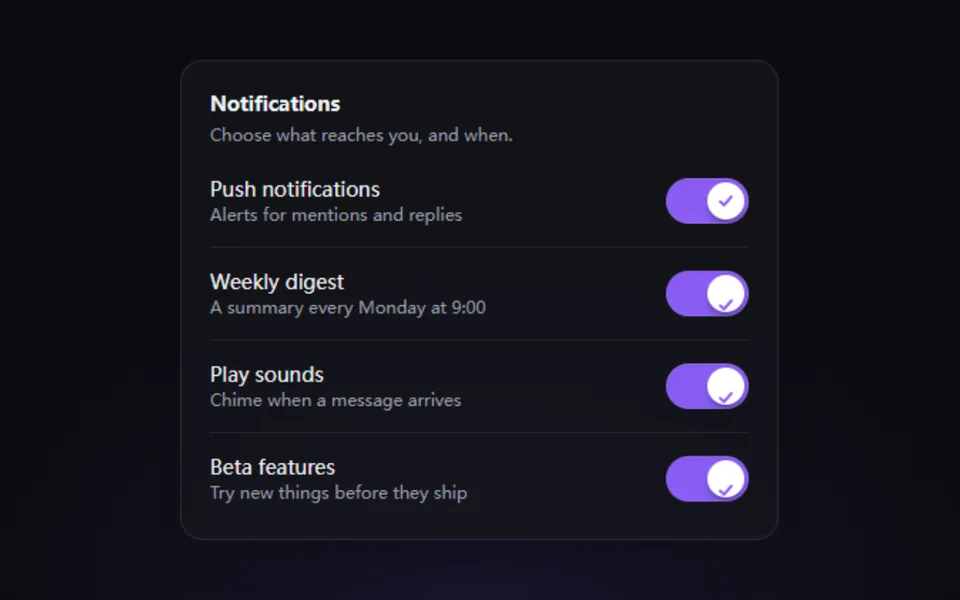
The thumb stretches under your finger and springs across on release while the track color follows. Optional check glyphs or ON / OFF text. Made for notification, privacy and feature settings.
- React · Motion
- MIT
- educlopez/smoothui
- Remix this
Loading preview
Tune
Highlighted lines hold your current values; copies and downloads include them
// SPDX-License-Identifier: MIT// Copyright (c) 2024 Eduardo Calvo// Source: https://github.com/educlopez/smoothui/blob/b6312bc/packages/smoothui/components/animated-toggle/index.tsx// Modified by Motif; see the item's provenance.import { cn } from '@motif/runtime'import { AnimatePresence, motion, useReducedMotion } from 'motion/react'import { useState, type CSSProperties } from 'react'/* @motif:defaults */export const defaults = { variant: 'icons', color: '#8b5cf6', size: 32, radius: 22, spring: { visualDuration: 0.32, bounce: 0.3, }, label: 'Push notifications',}/* @motif:end */export type ToggleSpringProps = Partial<typeof defaults> & { checked?: boolean defaultChecked?: boolean onCheckedChange?: (checked: boolean) => void /** 标签下方的说明文字。 */ description?: string disabled?: boolean /** 强制显示按下的形态(演示自动播放用)。 */ pressed?: boolean name?: string className?: string style?: CSSProperties}/** 弹簧开关:按下时滑块变长,松开后弹到另一端;role="switch",Space / Enter 切换,点击标签同样切换。 */export function ToggleSpring({ checked, defaultChecked = false, onCheckedChange, description, disabled, pressed: forcedPressed, name, className, style, ...props }: ToggleSpringProps) { const { variant, color, size, radius, spring, label } = { ...defaults, ...props } const reduced = useReducedMotion() const [inner, setInner] = useState(defaultChecked) const [down, setDown] = useState(false) const on = checked ?? inner const pressed = forcedPressed ?? down const pad = Math.max(2, Math.round(size * 0.1)) const thumb = size - pad * 2 const width = variant === 'labels' ? Math.round(size * 2.25) : Math.round(size * 1.8) const thumbWidth = pressed && !disabled ? Math.round(thumb * 1.3) : thumb const travel = width - pad * 2 - thumbWidth const trackRadius = Math.min(radius, size / 2) const glyph = Math.round(size * 0.44) const toggle = () => { if (disabled) return const next = !on if (checked === undefined) setInner(next) onCheckedChange?.(next) } const transition = reduced ? { duration: 0 } : { type: 'spring' as const, visualDuration: spring.visualDuration, bounce: spring.bounce } return ( <label className={cn('flex items-center gap-3.5 select-none', disabled ? 'cursor-not-allowed opacity-50' : 'cursor-pointer', className)} style={style}> <button type="button" role="switch" aria-checked={on} disabled={disabled} name={name} onClick={toggle} onPointerDown={() => setDown(true)} onPointerUp={() => setDown(false)} onPointerLeave={() => setDown(false)} onPointerCancel={() => setDown(false)} className="relative shrink-0 rounded-(--r) outline-none focus-visible:outline-2 focus-visible:outline-offset-2 focus-visible:outline-(--c)" style={{ '--c': color, '--r': `${trackRadius}px`, width, height: size } as CSSProperties} > <span aria-hidden className="absolute inset-0 rounded-[inherit] shadow-inner ring-1 ring-foreground/10 ring-inset transition-colors duration-200" style={{ backgroundColor: on ? color : 'color-mix(in oklab, var(--foreground) 16%, transparent)' }} /> {variant === 'labels' && ( <span aria-hidden className="absolute inset-0 flex items-center text-[10px] font-bold tracking-wider text-white/90" style={{ [on ? 'paddingLeft' : 'paddingRight']: pad + 5, justifyContent: on ? 'flex-start' : 'flex-end' }}> <span className={on ? '' : 'text-foreground/45'}>{on ? 'ON' : 'OFF'}</span> </span> )} <motion.span aria-hidden className="absolute grid place-items-center bg-white shadow-md shadow-black/30" style={{ left: pad, top: pad, height: thumb, borderRadius: Math.max(trackRadius - pad, 3) }} initial={false} animate={{ x: on ? travel : 0, width: thumbWidth }} transition={transition} > {variant === 'icons' && ( <AnimatePresence initial={false} mode="popLayout"> <motion.svg key={on ? 'on' : 'off'} viewBox="0 0 16 16" width={glyph} height={glyph} fill="none" strokeWidth="2.2" strokeLinecap="round" strokeLinejoin="round" stroke={on ? color : '#71717a'} initial={reduced ? { opacity: 0 } : { opacity: 0, scale: 0.4, rotate: -40 }} animate={{ opacity: 1, scale: 1, rotate: 0 }} exit={reduced ? { opacity: 0 } : { opacity: 0, scale: 0.4, rotate: 40 }} transition={{ duration: 0.18 }} > {on ? <path d="m3.5 8.5 3 3 6-7" /> : <path d="m4 4 8 8M12 4l-8 8" />} </motion.svg> </AnimatePresence> )} </motion.span> </button> {(label || description) && ( <span className="flex min-w-0 flex-col"> {label && <span className="text-sm leading-5 font-medium text-foreground">{label}</span>} {description && <span className="text-xs leading-4 text-muted-foreground">{description}</span>} </span> )} </label> )}