Segmented Control
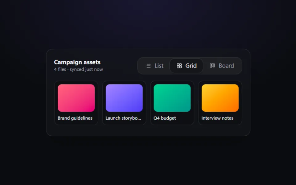
One thumb springs between mutually exclusive options, with icons, text or both. Made for view switchers (list / grid / board), time ranges and theme pickers.
- React · Motion
- MIT
- iurvish/uselayouts
- Remix this
Loading preview
Tune
Highlighted lines hold your current values; copies and downloads include them
// SPDX-License-Identifier: MIT// Copyright (c) 2025 Urvish Mali// Source: https://github.com/iurvish/uselayouts/blob/678a478/registry/default/example/discrete-tabs.tsx// Modified by Motif; see the item's provenance.import { cn } from '@motif/runtime'import { motion, useReducedMotion } from 'motion/react'import { useId, useRef, useState, type CSSProperties, type KeyboardEvent, type ReactNode } from 'react'/* @motif:defaults */export const defaults = { content: 'both', thumb: 'raised', color: '#8b5cf6', size: 'md', radius: 12, spring: { visualDuration: 0.32, bounce: 0.18, },}/* @motif:end */export type SegmentOption = { value: string; label: string; icon?: ReactNode }export type ToggleSegmentedProps = Partial<typeof defaults> & { options?: SegmentOption[] value?: string defaultValue?: string onValueChange?: (value: string) => void /** radiogroup 的无障碍名称。 */ label?: string className?: string style?: CSSProperties}const SAMPLE: SegmentOption[] = [ { value: 'day', label: 'Day' }, { value: 'week', label: 'Week' }, { value: 'month', label: 'Month' },]const SIZES = { sm: 'h-7 gap-1.5 px-3 text-xs', md: 'h-9 gap-2 px-4 text-sm', lg: 'h-11 gap-2.5 px-5 text-[15px]',} as const/** 分段控件:一个滑动滑块在几个互斥选项间移动;role="radiogroup",方向键移动并选中,Tab 只停在当前项。 */export function ToggleSegmented({ options = SAMPLE, value, defaultValue, onValueChange, label = 'Options', className, style, ...props }: ToggleSegmentedProps) { const { content, thumb, color, size, radius, spring } = { ...defaults, ...props } const reduced = useReducedMotion() const uid = useId() const [inner, setInner] = useState(defaultValue ?? options[0]?.value ?? '') const current = value ?? inner const index = Math.max(0, options.findIndex((option) => option.value === current)) const groupRef = useRef<HTMLDivElement>(null) const select = (next: string) => { if (value === undefined) setInner(next) onValueChange?.(next) } const onKeyDown = (event: KeyboardEvent) => { let target: number if (event.key === 'ArrowRight' || event.key === 'ArrowDown') target = (index + 1) % options.length else if (event.key === 'ArrowLeft' || event.key === 'ArrowUp') target = (index - 1 + options.length) % options.length else if (event.key === 'Home') target = 0 else if (event.key === 'End') target = options.length - 1 else return event.preventDefault() select(options[target]!.value) groupRef.current?.querySelectorAll<HTMLElement>('[role="radio"]')[target]?.focus() } const transition = reduced ? { duration: 0 } : { type: 'spring' as const, visualDuration: spring.visualDuration, bounce: spring.bounce } const showIcon = content !== 'text' const showText = content !== 'icons' return ( <div ref={groupRef} role="radiogroup" aria-label={label} onKeyDown={onKeyDown} className={cn('relative isolate inline-flex bg-muted p-1 ring-1 ring-border/70 ring-inset', className)} style={{ '--c': color, borderRadius: radius + 4, ...style } as CSSProperties} > {options.map((option, i) => { const selected = i === index return ( <button key={option.value} type="button" role="radio" aria-checked={selected} aria-label={showText ? undefined : option.label} tabIndex={selected ? 0 : -1} onClick={() => select(option.value)} className={cn( 'relative inline-flex items-center justify-center font-medium whitespace-nowrap outline-none select-none', 'transition-colors duration-150 focus-visible:outline-2 focus-visible:outline-offset-2 focus-visible:outline-(--c)', SIZES[size as keyof typeof SIZES] ?? SIZES.md, !showText && 'px-0 [aspect-ratio:1.25]', selected ? (thumb === 'solid' ? 'text-white' : 'text-foreground') : 'text-muted-foreground hover:text-foreground', )} style={{ borderRadius: radius }} > {selected && ( <motion.span layoutId={`${uid}-thumb`} aria-hidden transition={transition} className={cn('absolute inset-0 -z-10', thumb === 'solid' ? 'shadow-lg shadow-black/30 ring-1 ring-white/20 ring-inset' : 'bg-card shadow-md shadow-black/25 ring-1 ring-border')} style={{ borderRadius: radius, backgroundColor: thumb === 'solid' ? color : undefined }} /> )} {showIcon && option.icon && <span className="relative grid size-4 place-items-center [&>svg]:size-full">{option.icon}</span>} {showText && <span className="relative">{option.label}</span>} </button> ) })} </div> )}