Image Comparison
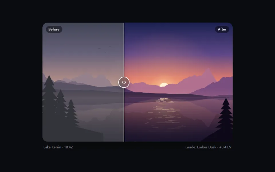
Two images stacked with a divider you drag, click or arrow-key across, following on a spring; the Before / After labels step aside as the divider nears them. For photo edits, enhancement results, redesigns and renovation stories.
- React · Motion · Canvas
- MIT
- ibelick/motion-primitives
- Remix this
Loading preview
Tune
Highlighted lines hold your current values; copies and downloads include them
// SPDX-License-Identifier: MIT// Copyright (c) 2024 ibelick// Source: https://github.com/ibelick/motion-primitives/blob/120f64f/components/core/image-comparison.tsx// Modified by Motif; see the item's provenance.import { motion, useMotionValue, useReducedMotion, useSpring, useTransform, type MotionValue } from 'motion/react'import { cn } from '@motif/runtime'import { createContext, useContext, useEffect, useRef, useState, type CSSProperties, type KeyboardEvent, type PointerEvent, type ReactNode } from 'react'/* @motif:defaults */export const defaults = { position: 50, interaction: 'drag', spring: { visualDuration: 0.3, bounce: 0.1, }, handle: 'circle', lineWidth: 2, lineColor: '#ffffff', radius: 18, labels: true,}/* @motif:end */type ComparisonContextValue = { /** 画面上的位置(0–100),带弹簧。 */ shown: MotionValue<number> /** 当前的值(0–100),给读屏和键盘用。 */ value: number commit: (next: number) => void handle: string lineWidth: number lineColor: string labels: boolean}const ComparisonContext = createContext<ComparisonContextValue | null>(null)function useComparison() { const context = useContext(ComparisonContext) if (!context) throw new Error('ImageComparison parts must be used inside <ImageComparison>') return context}const clamp = (value: number, min = 0, max = 100) => Math.min(max, Math.max(min, value))export type ImageComparisonProps = Partial<typeof defaults> & { /** 两张 ImageComparisonImage 和一个 ImageComparisonSlider。 */ children: ReactNode /** 受控:分割线位置,0–100(从左边算)。 */ value?: number onValueChange?: (value: number) => void className?: string style?: CSSProperties}/** * 前后对比:两层图叠放,各自按分割线位置裁切。拖动、点击任意位置或聚焦分割线后用方向键调节, * 位置经过弹簧再画到屏幕上。默认 16:10,用 className 改尺寸。 */export function ImageComparison({ children, value, onValueChange, className, style, ...props }: ImageComparisonProps) { const { position, interaction, spring, handle, lineWidth, lineColor, radius, labels } = { ...defaults, ...props } const reduced = Boolean(useReducedMotion()) const [inner, setInner] = useState(position) const current = clamp(value ?? inner) const target = useMotionValue(current) const smooth = useSpring(target, { visualDuration: spring.visualDuration, bounce: spring.bounce }) // 减少动态效果时直接跳到位,不走弹簧。 const shown = reduced ? target : smooth const rootRef = useRef<HTMLDivElement>(null) const dragging = useRef(false) // 调「初始位置」参数时分割线跟过去。 useEffect(() => setInner(position), [position]) useEffect(() => target.set(current), [current, target]) const commit = (next: number) => { const v = clamp(next) setInner(v) onValueChange?.(v) } const fromPointer = (event: PointerEvent) => { const rect = rootRef.current?.getBoundingClientRect() if (!rect || rect.width === 0) return current return ((event.clientX - rect.left) / rect.width) * 100 } const onPointerDown = (event: PointerEvent<HTMLDivElement>) => { if (interaction !== 'drag' || event.button !== 0) return dragging.current = true event.currentTarget.setPointerCapture(event.pointerId) // 让分割线拿到焦点,接着就能用键盘微调;指针操作不会显示焦点环。 rootRef.current?.querySelector<HTMLElement>('[role="slider"]')?.focus({ preventScroll: true }) commit(fromPointer(event)) } const onPointerMove = (event: PointerEvent<HTMLDivElement>) => { if (interaction === 'hover' || dragging.current) commit(fromPointer(event)) } const endDrag = (event: PointerEvent<HTMLDivElement>) => { if (!dragging.current) return dragging.current = false if (event.currentTarget.hasPointerCapture(event.pointerId)) event.currentTarget.releasePointerCapture(event.pointerId) } return ( <ComparisonContext.Provider value={{ shown, value: current, commit, handle, lineWidth, lineColor, labels }}> <div ref={rootRef} className={cn('relative isolate aspect-[16/10] w-full cursor-ew-resize touch-pan-y overflow-hidden bg-muted select-none', className)} style={{ borderRadius: radius, ...style }} onPointerDown={onPointerDown} onPointerMove={onPointerMove} onPointerUp={endDrag} onPointerCancel={endDrag} > {children} </div> </ComparisonContext.Provider> )}export type ImageComparisonImageProps = { /** before 显示在分割线左边,after 显示在右边。 */ side: 'before' | 'after' /** 有 src 时渲染 <img>;没有时渲染 children(例如同一个界面的两种状态)。 */ src?: string alt?: string /** 角落里的标签,例如 Before / After。 */ label?: string children?: ReactNode className?: string}export function ImageComparisonImage({ side, src, alt = '', label, children, className }: ImageComparisonImageProps) { const { shown, labels } = useComparison() const before = side === 'before' const clipPath = useTransform(shown, (v) => (before ? `inset(0 ${100 - v}% 0 0)` : `inset(0 0 0 ${v}%)`)) // 分割线靠近标签所在的边时,标签提前淡出,不会被切成半截。 const labelOpacity = useTransform(shown, (v) => clamp(before ? (v - 14) / 10 : (86 - v) / 10, 0, 1)) return ( <motion.div className={cn('absolute inset-0', className)} style={{ clipPath }}> {src ? <img src={src} alt={alt} draggable={false} className="pointer-events-none h-full w-full object-cover" /> : children} {labels && label && ( <motion.span aria-hidden className={cn('absolute top-3 rounded-full bg-black/45 px-2.5 py-1 text-xs font-medium tracking-wide text-white backdrop-blur-sm', before ? 'left-3' : 'right-3')} style={{ opacity: labelOpacity }} > {label} </motion.span> )} </motion.div> )}export type ImageComparisonSliderProps = { /** 自定义把手;不传时按 handle 参数画。 */ children?: ReactNode className?: string 'aria-label'?: string}/** 分割线和把手。它本身是一个 role="slider":可以 Tab 到,方向键、Page Up / Down、Home、End 调节。 */export function ImageComparisonSlider({ children, className, 'aria-label': ariaLabel = 'Comparison position' }: ImageComparisonSliderProps) { const { shown, value, commit, handle, lineWidth, lineColor } = useComparison() // 整层铺满再按自身宽度的百分比平移:只动 transform,不触发布局。 const x = useTransform(shown, (v) => `${v}%`) const onKeyDown = (event: KeyboardEvent<HTMLDivElement>) => { const step = event.shiftKey ? 10 : 2 const next = event.key === 'ArrowLeft' || event.key === 'ArrowDown' ? value - step : event.key === 'ArrowRight' || event.key === 'ArrowUp' ? value + step : event.key === 'PageDown' ? value - 10 : event.key === 'PageUp' ? value + 10 : event.key === 'Home' ? 0 : event.key === 'End' ? 100 : null if (next === null) return event.preventDefault() commit(next) } return ( <motion.div className="pointer-events-none absolute inset-0 z-10" style={{ x }}> <div role="slider" tabIndex={0} aria-label={ariaLabel} aria-orientation="horizontal" aria-valuemin={0} aria-valuemax={100} aria-valuenow={Math.round(value)} aria-valuetext={`${Math.round(value)}% before`} onKeyDown={onKeyDown} className={cn('group pointer-events-auto absolute inset-y-0 left-0 w-11 -translate-x-1/2 cursor-ew-resize outline-none', className)} > <span className="absolute inset-y-0 left-1/2 -translate-x-1/2 transition-[box-shadow] duration-150" style={{ width: lineWidth, background: lineColor, boxShadow: '0 0 0 0.5px rgb(0 0 0 / 0.12), 0 0 14px rgb(0 0 0 / 0.28)' }} /> {children ?? <Knob handle={handle} color={lineColor} />} </div> </motion.div> )}function Knob({ handle, color }: { handle: string; color: string }) { // 焦点环画在把手上(只有线时画在一圈细光晕上),只在键盘聚焦时出现。 const ring = 'group-focus-visible:ring-2 group-focus-visible:ring-ring group-focus-visible:ring-offset-2 group-focus-visible:ring-offset-black/40' if (handle === 'line') { return <span className={cn('absolute inset-y-3 left-1/2 w-3 -translate-x-1/2 rounded-full', ring)} /> } if (handle === 'pill') { return ( <span className={cn('absolute top-1/2 left-1/2 grid h-12 w-6 -translate-1/2 place-items-center rounded-full shadow-[0_6px_18px_-4px_rgb(0_0_0/0.5)]', ring)} style={{ background: color }} > <span className="flex flex-col gap-1"> {[0, 1, 2].map((i) => ( <span key={i} className="block h-0.5 w-2.5 rounded-full bg-black/35" /> ))} </span> </span> ) } return ( <span className={cn('absolute top-1/2 left-1/2 grid size-10 -translate-1/2 place-items-center rounded-full border-2 bg-black/30 shadow-[0_6px_20px_-6px_rgb(0_0_0/0.6)] backdrop-blur-md', ring)} style={{ borderColor: color, color }} > <svg viewBox="0 0 24 24" className="size-5" fill="none" stroke="currentColor" strokeWidth="2" strokeLinecap="round" strokeLinejoin="round" aria-hidden> <path d="m9 7-5 5 5 5M15 7l5 5-5 5" /> </svg> </span> )}