Metal Button
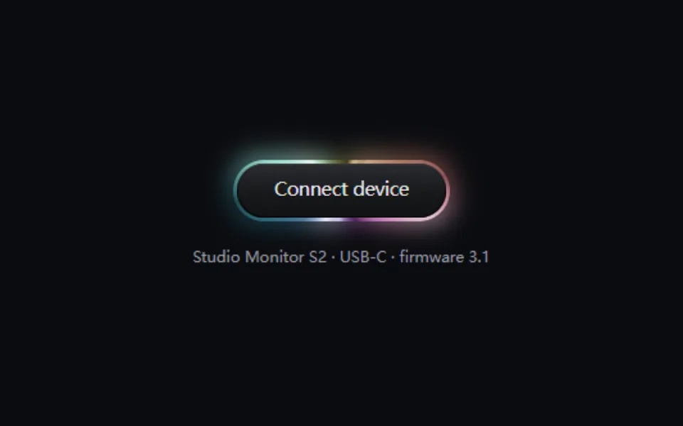
A polished metal ring wraps the button: reflections drift around it while a second highlight sweeps the other way, so glints split and merge and the halo brightens with them. Chrome, chromatic, gold and titanium finishes. For hardware, pro tools and premium plans.
- React · CSS
- MIT
- nolly-studio/cult-ui
- Remix this
Loading preview
Tune
Highlighted lines hold your current values; copies and downloads include them
// SPDX-License-Identifier: MIT// Copyright (c) 2023 Jordan-Gilliam// Source: https://github.com/nolly-studio/cult-ui/blob/ee98a5d/apps/www/registry/default/ui/metal-button.tsx// Modified by Motif; see the item's provenance.import { cn, cssVars } from '@motif/runtime'import type { ComponentProps, CSSProperties } from 'react'/* @motif:defaults */export const defaults = { label: 'Connect device', finish: 'chromatic', face: 'graphite', ringWidth: 3, radius: 24, strength: 0.9, glow: 0.6, speed: 7,}/* @motif:end */export type MetalButtonProps = Partial<typeof defaults> & Omit<ComponentProps<'button'>, keyof typeof defaults>interface Finish { /** 锥形渐变的色标:亮暗交替的反光带。 */ bands: string /** 「反光强度」调低时往这个中间色压平。 */ flat: string /** 外圈光晕的颜色。 */ glow: string /** 叠一层彩虹色相(只取色相,保留金属的明暗)。 */ chroma?: boolean}const CHROME = '#5f6066 0deg, #d9dadf 24deg, #8b8c93 48deg, #2b2c31 72deg, #a7a8ae 100deg, #f7f7f9 126deg, #6d6e74 150deg, #36373c 182deg, #c9cad0 210deg, #fbfbfc 232deg, #7a7b81 258deg, #2f3035 290deg, #b4b5bb 320deg, #5f6066 360deg'const FINISHES: Record<string, Finish> = { chrome: { bands: CHROME, flat: '#8d8e94', glow: 'rgb(226 230 240 / 0.55)' }, chromatic: { bands: CHROME, flat: '#8d8e94', glow: 'rgb(200 186 255 / 0.55)', chroma: true }, gold: { bands: '#7a5a1e 0deg, #f3d58a 24deg, #b1832f 48deg, #4a330d 72deg, #d9ad54 100deg, #fff0c2 126deg, #94702a 150deg, #563b10 182deg, #e6c06a 210deg, #fff6d6 232deg, #a07a2c 258deg, #4d3510 290deg, #cfa24c 320deg, #7a5a1e 360deg', flat: '#a8823a', glow: 'rgb(255 205 110 / 0.5)', }, titanium: { bands: '#3c3f47 0deg, #a6abb8 24deg, #5b5f6a 48deg, #1c1e23 72deg, #7d828f 100deg, #d4d8e2 126deg, #4a4e58 150deg, #22242a 182deg, #9196a3 210deg, #e3e6ee 232deg, #575b66 258deg, #1f2126 290deg, #868b98 320deg, #3c3f47 360deg', flat: '#5f636e', glow: 'rgb(150 170 210 / 0.45)', },}/** 按钮面板:石墨(深色)、银面(浅色)、主题主色。 */const FACES: Record<string, { face: CSSProperties; ink: string; emboss: string }> = { graphite: { face: { background: 'linear-gradient(180deg, #2b2c31 0%, #17181b 55%, #111214 100%)', boxShadow: 'inset 0 1px 0 rgb(255 255 255 / 0.14), inset 0 -1px 0 rgb(0 0 0 / 0.5), inset 0 0 0 1px rgb(0 0 0 / 0.6)', }, ink: '#ececf0', emboss: '0 1px 0 rgb(0 0 0 / 0.6)', }, silver: { face: { background: 'linear-gradient(180deg, #fbfbfc 0%, #dcdde1 55%, #c6c7cd 100%)', boxShadow: 'inset 0 1px 0 #ffffff, inset 0 -1px 1px rgb(0 0 0 / 0.18), inset 0 0 0 1px rgb(0 0 0 / 0.35)', }, ink: '#1d1e23', emboss: '0 1px 0 rgb(255 255 255 / 0.75)', }, accent: { face: { background: 'linear-gradient(180deg, color-mix(in oklab, var(--primary), white 14%) 0%, var(--primary) 60%, color-mix(in oklab, var(--primary), black 12%) 100%)', boxShadow: 'inset 0 1px 0 rgb(255 255 255 / 0.3), inset 0 -1px 0 rgb(0 0 0 / 0.25), inset 0 0 0 1px rgb(0 0 0 / 0.45)', }, ink: 'var(--primary-foreground)', emboss: '0 1px 0 rgb(255 255 255 / 0.2)', },}/** * 金属环按钮:一圈抛光金属包着按钮面板,反光带缓缓绕着环转,另一层高光反向转动, * 两者叠在一起,亮斑会分开、汇合,像液态金属。全部是 CSS:只转动 transform,不用 WebGL。 */export function MetalButton({ className, style, children, type = 'button', ...props }: MetalButtonProps) { const { label, finish, face, ringWidth, radius, speed, strength, glow, ...rest } = { ...defaults, ...props } const metal = FINISHES[finish] ?? FINISHES.chrome! const panel = FACES[face] ?? FACES.graphite! const layers = ( <> <span className="mmb-spin" /> <span className="mmb-sheen" /> {metal.chroma && <span className="mmb-chroma" />} </> ) return ( <button type={type} {...rest} className={cn( 'mmb group relative isolate inline-flex h-12 shrink-0 cursor-pointer items-center justify-center px-8 text-[15px] font-medium tracking-tight whitespace-nowrap select-none', 'transition-[scale] duration-150 ease-out active:scale-[0.98]', 'focus-visible:outline-2 focus-visible:outline-offset-4 focus-visible:outline-ring disabled:pointer-events-none disabled:opacity-50', className, )} style={cssVars( { '--mmb-bands': metal.bands, '--mmb-flat': metal.flat, '--mmb-glow': metal.glow, '--mmb-ring': `${ringWidth}px`, '--mmb-speed': `${speed}s`, }, { borderRadius: radius, color: panel.ink, // 外沿一圈深色细线:反光再亮,环的轮廓也不会糊进背景(对应上游的 stable edge)。 boxShadow: '0 0 0 1px rgb(0 0 0 / 0.55), 0 10px 24px -12px rgb(0 0 0 / 0.9)', ...style, }, )} > {/* 光晕:同一圈金属放大、模糊后垫在下面,亮斑转到哪,哪里的光晕就亮。 */} <span aria-hidden className="mmb-halo" style={{ opacity: glow }}> {layers} </span> {/* 金属环:遮罩只留下 ringWidth 宽的一圈。 */} <span aria-hidden className="mmb-ring"> {layers} <span className="mmb-flat" style={{ opacity: 1 - strength }} /> </span> {/* 面板 */} <span aria-hidden className="mmb-face" style={{ ...panel.face, borderRadius: `max(${radius - ringWidth}px, 0px)` }} /> <span className="relative" style={{ textShadow: panel.emboss }}> {children ?? label} </span> </button> )}