Hold Button
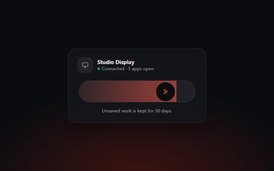
Press and hold: color sweeps across the button and the action only confirms once it is full. A calm guard for destructive, irreversible actions.
- React · Motion
- MIT
- kokonut-labs/kokonutui
- Remix this
Loading preview
Tune
Highlighted lines hold your current values; copies and downloads include them
// SPDX-License-Identifier: MIT// Copyright (c) 2025 kokonutUI// Source: https://github.com/kokonut-labs/kokonutui/blob/83eec6d/components/kokonutui/hold-button.tsx// Modified by Motif; see the item's provenance.import { animate, motion, useMotionValue, useReducedMotion, useTransform, type AnimationPlaybackControls } from 'motion/react'import { cn } from '@motif/runtime'import { useEffect, useRef, useState, type CSSProperties, type KeyboardEvent } from 'react'/* @motif:defaults */export const defaults = { holdDuration: 1.6, color: '#f43f5e', radius: 14, width: 232, icon: 'trash', label: 'Hold to delete', holdLabel: 'Keep holding', doneLabel: 'Deleted',}/* @motif:end */export type HoldButtonProps = Partial<typeof defaults> & { className?: string style?: CSSProperties /** 从外部驱动「按住」(演示的自动播放用);真实按压照常生效。 */ holding?: boolean onComplete?: () => void}const ICONS: Record<string, string> = { trash: 'M4 7h16M10 11v6m4-6v6M6 7l1 12a2 2 0 0 0 2 2h6a2 2 0 0 0 2-2l1-12M9 7V4h6v3', power: 'M12 3v9m5.7-6.3a8 8 0 1 1-11.4 0', lock: 'M7 11V8a5 5 0 0 1 10 0v3M6 11h12a1 1 0 0 1 1 1v7a1 1 0 0 1-1 1H6a1 1 0 0 1-1-1v-7a1 1 0 0 1 1-1Z',}const DONE_SECONDS = 1.5/** * 长按确认:按住期间颜色从左向右填满,填满才触发 onComplete。 * 完成后需要先松手才能再次按住,避免长按不放时反复触发。 */export function HoldButton({ className, style, holding, onComplete, ...props }: HoldButtonProps) { const { holdDuration, color, radius, width, icon, label, holdLabel, doneLabel } = { ...defaults, ...props } const reduced = useReducedMotion() const progress = useMotionValue(0) const timer = useMotionValue(0) const [pressed, setPressed] = useState(false) const [done, setDone] = useState(false) const active = pressed || Boolean(holding) const running = useRef<AnimationPlaybackControls | null>(null) const needsRelease = useRef(false) const completeRef = useRef(onComplete) completeRef.current = onComplete useEffect(() => { if (!active) needsRelease.current = false if (done) return running.current?.stop() if (active && !needsRelease.current) { running.current = animate(progress, 1, { duration: holdDuration, ease: 'linear', onComplete: () => { needsRelease.current = true setDone(true) completeRef.current?.() }, }) } else { running.current = animate(progress, 0, { duration: 0.28, ease: 'easeOut' }) } return () => running.current?.stop() }, [active, done, holdDuration, progress]) // 完成状态停留一会儿再复位;用 motion 的时钟而不是 setTimeout,录屏时也是确定的。 useEffect(() => { if (!done) return timer.set(0) const controls = animate(timer, 1, { duration: DONE_SECONDS, ease: 'linear', onComplete: () => { setDone(false) animate(progress, 0, { duration: 0.4, ease: 'easeOut' }) }, }) return () => controls.stop() }, [done, timer, progress]) const fillX = useTransform(progress, (v) => `${(v - 1) * 100}%`) const iconScale = useTransform(progress, [0, 1], [1, 1.2]) const holdingNow = active && !done && !needsRelease.current const start = () => setPressed(true) const end = () => setPressed(false) const onKeyDown = (event: KeyboardEvent) => { if ((event.key === ' ' || event.key === 'Enter') && !event.repeat) { event.preventDefault() start() } } const onKeyUp = (event: KeyboardEvent) => { if (event.key === ' ' || event.key === 'Enter') end() } const text = (visible: boolean) => ({ opacity: visible ? 1 : 0, y: reduced ? 0 : visible ? 0 : 6 }) const showHold = holdingNow return ( <motion.button type="button" onPointerDown={(event) => { if (event.button !== 0) return event.currentTarget.setPointerCapture?.(event.pointerId) start() }} onPointerUp={end} onPointerCancel={end} onLostPointerCapture={end} onKeyDown={onKeyDown} onKeyUp={onKeyUp} onBlur={end} onContextMenu={(event) => event.preventDefault()} animate={{ scale: !reduced && holdingNow ? 0.975 : 1 }} transition={{ type: 'spring', visualDuration: 0.25, bounce: 0.25 }} className={cn( 'relative inline-flex touch-none items-center justify-center overflow-hidden border py-3 text-sm font-medium tracking-tight outline-none select-none focus-visible:ring-2 focus-visible:ring-ring', className, )} style={ { '--hb': color, width, borderRadius: radius, background: 'color-mix(in oklab, var(--hb) 12%, transparent)', borderColor: 'color-mix(in oklab, var(--hb) 38%, transparent)', color: 'color-mix(in oklab, var(--hb) 78%, var(--foreground))', ...style, } as CSSProperties } > {/* 填充层整体向左偏移 (1 - progress),用 transform 推进而不是改 width。 */} <motion.span aria-hidden className="absolute inset-0" style={{ x: fillX, background: 'color-mix(in oklab, var(--hb) 34%, transparent)', boxShadow: '2px 0 14px color-mix(in oklab, var(--hb) 70%, transparent)', borderRight: '1.5px solid var(--hb)', }} /> <span className="relative z-10 grid place-items-center"> {/* 三段文案叠在同一格里,按钮宽度不随状态变化。 */} <span className="col-start-1 row-start-1 inline-flex items-center gap-2"> <span className="relative grid size-4 place-items-center"> <motion.svg viewBox="0 0 24 24" className="col-start-1 row-start-1 size-4" fill="none" stroke="currentColor" strokeWidth="2" strokeLinecap="round" strokeLinejoin="round" style={{ scale: reduced ? 1 : iconScale }} animate={{ opacity: done ? 0 : 1 }} transition={{ duration: 0.15 }} aria-hidden > <path d={ICONS[icon] ?? ICONS.trash} /> </motion.svg> <motion.svg viewBox="0 0 24 24" className="absolute inset-0 size-4" fill="none" stroke="currentColor" strokeWidth="2.6" strokeLinecap="round" strokeLinejoin="round" animate={{ opacity: done ? 1 : 0, scale: done || reduced ? 1 : 0.6 }} transition={{ duration: 0.2 }} aria-hidden > <path d="m5 12.5 4.5 4.5L19 7.5" /> </motion.svg> </span> <span className="grid"> <motion.span className="col-start-1 row-start-1" animate={text(!showHold && !done)} transition={{ duration: 0.18 }}> {label} </motion.span> <motion.span className="col-start-1 row-start-1" animate={text(showHold)} transition={{ duration: 0.18 }}> {holdLabel} </motion.span> <motion.span className="col-start-1 row-start-1" animate={text(done)} transition={{ duration: 0.18 }}> {doneLabel} </motion.span> </span> </span> </span> <span className="sr-only" aria-live="polite"> {done ? doneLabel : ''} </span> </motion.button> )}