Interactive Hover Button
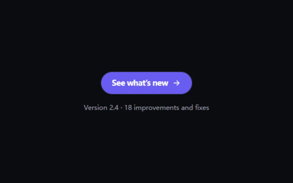
On hover the small dot beside the label floods the whole button with color while the label slides away and the same words return from the right with an arrow. For secondary actions that lead somewhere, like “See what’s new” or “Continue”.
- React · CSS
- MIT
- magicuidesign/magicui
- Remix this
Loading preview
Tune
Highlighted lines hold your current values; copies and downloads include them
// SPDX-License-Identifier: MIT// Copyright (c) Magic UI// Source: https://github.com/magicuidesign/magicui/blob/d7207e5/apps/www/registry/magicui/interactive-hover-button.tsx// Modified by Motif; see the item's provenance.import { cn, cssVars } from '@motif/runtime'import { useCallback, useLayoutEffect, useRef, type ComponentProps } from 'react'/* @motif:defaults */export const defaults = { label: 'See what’s new', color: '#6a5cf0', icon: 'arrow', dotSize: 8, radius: 28, duration: 0.4, easing: [0.25, 1, 0.5, 1],}/* @motif:end */export type InteractiveHoverButtonProps = Partial<typeof defaults> & Omit<ComponentProps<'button'>, keyof typeof defaults> & { /** 强制显示悬停状态(演示的自动播放用);真实悬停和键盘聚焦照常生效。 */ active?: boolean }const ICONS: Record<string, string> = { arrow: 'M5 12h14m-6-6 6 6-6 6', 'arrow-up-right': 'M7 17 17 7M8 7h9v9', chevron: 'm9 6 6 6-6 6', plus: 'M12 5v14M5 12h14',}const LIGHT_INK = '#ffffff'const DARK_INK = '#0b0b10'/** 填充色上的文字颜色:白字和深色字里对比度(WCAG)更高的那个。 */function inkFor(hex: string): string { const match = /^#?([0-9a-f]{6})/i.exec(hex) if (!match) return LIGHT_INK const value = Number.parseInt(match[1]!, 16) const [r, g, b] = [(value >> 16) & 255, (value >> 8) & 255, value & 255].map((channel) => { const c = channel / 255 return c <= 0.03928 ? c / 12.92 : ((c + 0.055) / 1.055) ** 2.4 }) as [number, number, number] const luminance = 0.2126 * r + 0.7152 * g + 0.0722 * b // 深色字 #0b0b10 的相对亮度约 0.0035。 return 1.05 / (luminance + 0.05) >= (luminance + 0.05) / 0.0535 ? LIGHT_INK : DARK_INK}/** * 悬停时文字旁的圆点扩散成整块底色,原文案向右滑出,带箭头的同一句话从右侧滑入。 * 状态全部由 CSS 决定(:hover、:focus-visible、[data-active]),不需要 JS 状态。 */export function InteractiveHoverButton({ className, style, children, active, type = 'button', ref, ...props }: InteractiveHoverButtonProps) { const { label, color, icon, dotSize, radius, duration, easing, ...rest } = { ...defaults, ...props } const content = children ?? label const button = useRef<HTMLButtonElement | null>(null) const dot = useRef<HTMLSpanElement>(null) const setRef = useCallback( (node: HTMLButtonElement | null) => { button.current = node if (typeof ref === 'function') ref(node) else if (ref) ref.current = node }, [ref], ) // 圆点正好放大到盖住按钮最远的角:放得太大,扩散会在前几十毫秒就结束,看不出「漫开」的过程。 // 用布局位置(offset*)而不是 getBoundingClientRect,后者会把正在进行的缩放算进去。 useLayoutEffect(() => { const element = button.current const point = dot.current if (!element || !point) return const measure = () => { const cx = point.offsetLeft + point.offsetWidth / 2 const cy = point.offsetTop + point.offsetHeight / 2 const reach = Math.hypot(Math.max(cx, element.clientWidth - cx), Math.max(cy, element.clientHeight - cy)) element.style.setProperty('--ihb-scale', String(Math.ceil((reach * 2 + 4) / Math.max(point.offsetWidth, 1)))) } measure() const observer = new ResizeObserver(measure) observer.observe(element) return () => observer.disconnect() }, [dotSize]) return ( <button ref={setRef} type={type} data-active={active ? '' : undefined} {...rest} className={cn( 'ihb relative inline-flex cursor-pointer items-center justify-center overflow-hidden border bg-background px-6 py-2.5 text-center text-sm font-semibold tracking-tight text-foreground', 'outline-none focus-visible:ring-2 focus-visible:ring-ring focus-visible:ring-offset-2 focus-visible:ring-offset-background disabled:pointer-events-none disabled:opacity-50', className, )} style={cssVars( { '--ihb-color': color, '--ihb-ink': inkFor(color), '--ihb-duration': `${duration}s`, '--ihb-ease': `cubic-bezier(${easing.join(', ')})`, }, { borderRadius: radius, ...style }, )} > {/* 减少动态效果时用的整块底色:不缩放,只淡入。 */} <span aria-hidden className="ihb-fill pointer-events-none absolute inset-0" /> <span className="flex items-center justify-center gap-2"> <span ref={dot} aria-hidden className="ihb-dot shrink-0 rounded-full" style={{ width: dotSize, height: dotSize }} /> <span className="ihb-label inline-block">{content}</span> </span> <span aria-hidden className="ihb-reveal pointer-events-none absolute inset-0 z-10 flex items-center justify-center gap-2"> <span>{content}</span> <svg viewBox="0 0 24 24" className="size-4 shrink-0" fill="none" stroke="currentColor" strokeWidth="2.2" strokeLinecap="round" strokeLinejoin="round"> <path d={ICONS[icon] ?? ICONS.arrow} /> </svg> </span> </button> )}