Progress Ring
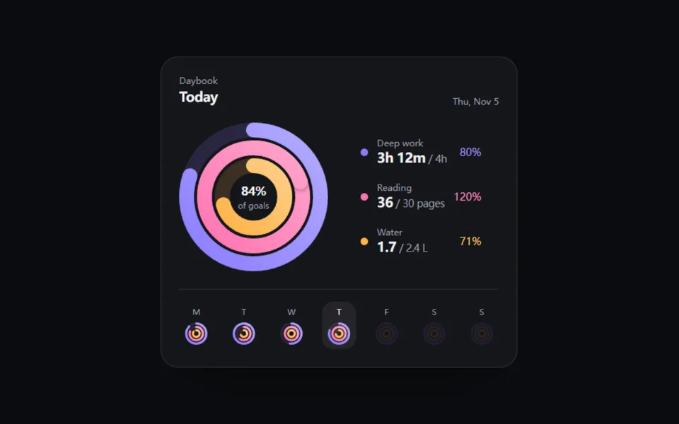
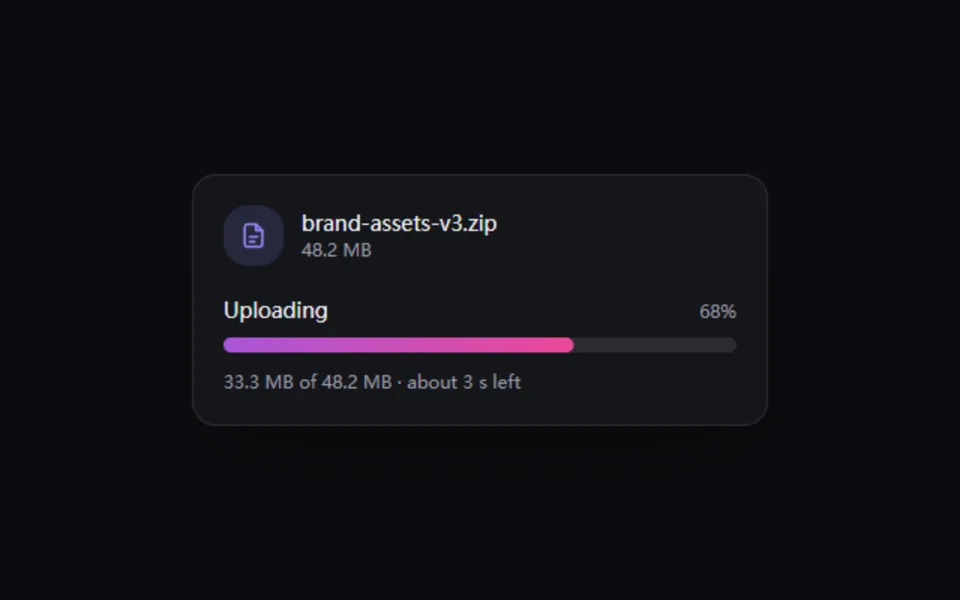
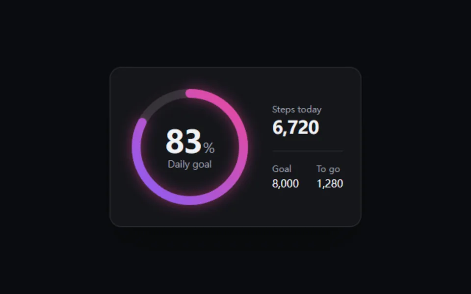
A gradient-stroked ring whose arc and center number ride one spring. Full ring, 270-degree gauge or tick dial, with optional glow. For goals, storage usage and scores.
- React · Motion · SVG
- MIT
- Remix this
Loading preview
Tune
Highlighted lines hold your current values; copies and downloads include them
import { animate, motion, useMotionValue, useMotionValueEvent, useReducedMotion, useTransform } from 'motion/react'import { cn } from '@motif/runtime'import { useEffect, useId, useState, type CSSProperties } from 'react'/* @motif:defaults */export const defaults = { variant: 'ring', size: 168, thickness: 12, color: '#8b5cf6', colorEnd: '#ec4899', cap: 'round', glow: true, spring: { visualDuration: 0.9, bounce: 0, }, label: 'Daily goal', showValue: true,}/* @motif:end */export type ProgressRingProps = Partial<typeof defaults> & { className?: string style?: CSSProperties /** 0–100。 */ value?: number}const TICKS = 48/** gauge 只画 270°,缺口朝下。 */const GAUGE_SHARE = 0.75/** * 环形确定进度:SVG 圆环用 pathLength=100 让 dasharray 直接等于百分比, * 弹簧插值同时驱动圆环和中间的数字。role="progressbar",图形本身对读屏隐藏。 */export function ProgressRing({ className, style, value = 0, ...props }: ProgressRingProps) { const { variant, size, thickness, color, colorEnd, cap, glow, spring, label, showValue } = { ...defaults, ...props } const reduced = useReducedMotion() const gradientId = useId() const target = Math.min(Math.max(value, 0), 100) const progress = useMotionValue(target) const [activeTicks, setActiveTicks] = useState(Math.round((target / 100) * TICKS)) useEffect(() => { const controls = reduced ? animate(progress, target, { duration: 0.2, ease: 'easeOut' }) : animate(progress, target, { type: 'spring', visualDuration: spring.visualDuration, bounce: Math.min(spring.bounce, 0.3) }) return () => controls.stop() }, [target, reduced, spring.visualDuration, spring.bounce, progress]) useMotionValueEvent(progress, 'change', (v) => { const next = Math.round((Math.min(Math.max(v, 0), 100) / 100) * TICKS) setActiveTicks((current) => (current === next ? current : next)) }) const stroke = (thickness / size) * 100 const radius = 50 - stroke / 2 - (glow ? 3 : 0.5) const share = variant === 'gauge' ? GAUGE_SHARE : 1 const trackDash = `${share * 100} 100` const fillDash = useTransform(progress, (v) => { const length = (Math.min(Math.max(v, 0), 100) / 100) * share * 100 return `${length} 100` }) // 进度接近 0 时圆头会画出一个小点,直接隐藏 const fillOpacity = useTransform(progress, (v) => (v < 0.6 ? 0 : 1)) const percent = useTransform(progress, (v) => Math.round(Math.min(Math.max(v, 0), 100))) const rotation = variant === 'gauge' ? 135 : -90 return ( <div role="progressbar" aria-label={label} aria-valuemin={0} aria-valuemax={100} aria-valuenow={Math.round(target)} aria-valuetext={`${label} ${Math.round(target)}%`} className={cn('relative inline-grid shrink-0 place-items-center', className)} style={{ width: size, height: size, ...style }} > <svg viewBox="0 0 100 100" className="absolute inset-0 size-full overflow-visible" aria-hidden style={{ filter: glow ? `drop-shadow(0 0 ${size * 0.05}px color-mix(in oklab, ${colorEnd} 55%, transparent))` : undefined }}> <defs> <linearGradient id={gradientId} x1="0" y1="0" x2="1" y2="1"> <stop offset="0" stopColor={color} /> <stop offset="1" stopColor={colorEnd} /> </linearGradient> </defs> {variant === 'dial' ? ( Array.from({ length: TICKS }, (_, i) => { const angle = (i / TICKS) * Math.PI * 2 - Math.PI / 2 const inner = radius - stroke * 1.1 const active = i < activeTicks return ( <line key={i} x1={50 + Math.cos(angle) * inner} y1={50 + Math.sin(angle) * inner} x2={50 + Math.cos(angle) * radius} y2={50 + Math.sin(angle) * radius} strokeWidth={Math.max(stroke * 0.22, 0.9)} strokeLinecap="round" stroke={active ? `url(#${gradientId})` : 'currentColor'} strokeOpacity={active ? 1 : 0.14} style={{ transition: 'stroke-opacity 0.3s ease-out' }} /> ) }) ) : ( <g transform={`rotate(${rotation} 50 50)`}> <circle cx="50" cy="50" r={radius} fill="none" stroke="currentColor" strokeOpacity="0.12" strokeWidth={stroke} strokeLinecap={cap as 'round' | 'butt'} pathLength={100} strokeDasharray={trackDash} /> <motion.circle cx="50" cy="50" r={radius} fill="none" stroke={`url(#${gradientId})`} strokeWidth={stroke} strokeLinecap={cap as 'round' | 'butt'} pathLength={100} style={{ strokeDasharray: fillDash, opacity: fillOpacity }} /> </g> )} </svg> {showValue && ( <div className="relative flex flex-col items-center text-center" aria-hidden style={{ marginTop: variant === 'gauge' ? size * 0.05 : 0 }}> <span className="flex items-baseline font-semibold leading-none tracking-tight tabular-nums text-foreground" style={{ fontSize: size * 0.25 }}> <motion.span>{percent}</motion.span> <span className="font-medium text-muted-foreground" style={{ fontSize: size * 0.11, marginLeft: size * 0.01 }}> % </span> </span> <span className="mt-[0.35em] leading-none text-muted-foreground" style={{ fontSize: Math.max(size * 0.075, 10) }}> {label} </span> </div> )} </div> )}