Goal Rings
Several goals as concentric rings, each sweeping to its completion on a spring; a ring past 100% runs a second lap with a shadow at its tip. Hover or focus a legend row to light up one ring and show its percentage in the middle. For habit trackers, daily goals and team targets.
- React · Motion · SVG
- MIT
- kokonut-labs/kokonutui
- Remix this
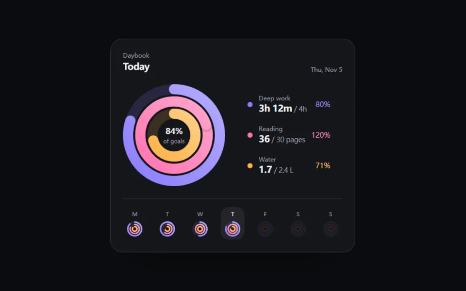
Loading preview
Tune
Highlighted lines hold your current values; copies and downloads include them
// SPDX-License-Identifier: MIT// Copyright (c) 2025 kokonutUI// Source: https://github.com/kokonut-labs/kokonutui/blob/83eec6d/components/kokonutui/apple-activity-card.tsx// Modified by Motif; see the item's provenance.import { animate, motion, useMotionValue, useReducedMotion, useTransform } from 'motion/react'import { cn } from '@motif/runtime'import { useEffect, useId, useState, type CSSProperties } from 'react'/* @motif:defaults */export const defaults = { size: 200, thickness: 20, gap: 4, palette: ['#8a7dff', '#ff74b1', '#ffb347'], trackOpacity: 0.16, spring: { visualDuration: 1.1, bounce: 0.05, }, stagger: 0.12, showLegend: true, showCenter: true,}/* @motif:end */export type GoalRing = { id: string label: string value: number goal: number /** 图例里显示的数值,默认是 value 本身。 */ display?: string /** 图例里显示的目标,默认是 goal 本身。 */ goalDisplay?: string}export type GoalRingsProps = Partial<typeof defaults> & { /** 由外向内的各个目标。 */ rings?: GoalRing[] /** 受控:高亮哪一环(null 为不高亮)。不传时由悬停、聚焦和点击图例决定。 */ active?: string | null onActiveChange?: (id: string | null) => void /** 没有高亮时,中间百分比下面的说明。 */ caption?: string className?: string style?: CSSProperties}const SAMPLE: GoalRing[] = [ { id: 'focus', label: 'Focus', value: 3.2, goal: 4, display: '3h 12m', goalDisplay: '4h' }, { id: 'reading', label: 'Reading', value: 36, goal: 30, display: '36', goalDisplay: '30 pages' }, { id: 'water', label: 'Water', value: 1.7, goal: 2.4, display: '1.7', goalDisplay: '2.4 L' },]/** 把 #rrggbb 往白色混一点,做渐变的亮端。 */function lighten(hex: string, amount: number): string { const n = Number.parseInt(hex.slice(1, 7), 16) const mix = (channel: number) => Math.round(channel + (255 - channel) * amount) const [r, g, b] = [(n >> 16) & 255, (n >> 8) & 255, n & 255].map(mix) as [number, number, number] return `rgb(${r} ${g} ${b})`}const progressOf = (ring: GoalRing) => (ring.goal > 0 ? Math.min(2, Math.max(0, ring.value / ring.goal)) : 0)type RingProps = { uid: string index: number ring: GoalRing center: number radius: number thickness: number color: string track: number delay: number spring: { visualDuration: number; bounce: number } reduced: boolean dimmed: boolean onHover: (id: string | null) => void}function Ring({ uid, index, ring, center, radius, thickness, color, track, delay, spring, reduced, dimmed, onHover }: RingProps) { const target = progressOf(ring) const progress = useMotionValue(reduced ? target : 0) useEffect(() => { if (reduced) { progress.set(target) return } const controls = animate(progress, target, { type: 'spring', visualDuration: spring.visualDuration, bounce: spring.bounce, delay }) return () => controls.stop() }, [progress, target, reduced, spring.visualDuration, spring.bounce, delay]) const circumference = 2 * Math.PI * radius // 第一圈和超出的第二圈各画一条弧;长度为 0 时把圆头也藏起来,不留一个点。 const firstLap = useTransform(progress, (p) => `${Math.min(p, 1) * circumference} ${circumference}`) const firstOpacity = useTransform(progress, (p) => (p < 0.004 ? 0 : 1)) const secondLap = useTransform(progress, (p) => `${Math.max(0, p - 1) * circumference} ${circumference}`) const secondOpacity = useTransform(progress, (p) => (p > 1.004 ? 1 : 0)) // 第二圈的环头:一个带投影的圆,压在第一圈上,看得出是绕了一圈又叠上来。 const tipX = useTransform(progress, (p) => center + radius * Math.cos(2 * Math.PI * p)) const tipY = useTransform(progress, (p) => center + radius * Math.sin(2 * Math.PI * p)) const stroke = { cx: center, cy: center, r: radius, fill: 'none', strokeWidth: thickness } return ( <g style={{ opacity: dimmed ? 0.28 : 1, transition: 'opacity 200ms ease-out' }} onPointerEnter={() => onHover(ring.id)} onPointerLeave={() => onHover(null)} > <circle {...stroke} stroke={color} strokeOpacity={track} /> <motion.circle {...stroke} stroke={`url(#${uid}-fill-${index})`} strokeLinecap="round" style={{ strokeDasharray: firstLap, opacity: firstOpacity }} /> {/* 环头的投影画在第二圈下面:朝后的那一半被弧本身盖住,只剩朝前的阴影落在第一圈上。 */} <motion.circle cx={tipX} cy={tipY} r={thickness / 2} fill={color} filter={`url(#${uid}-tip)`} style={{ opacity: secondOpacity }} /> <motion.circle {...stroke} stroke={`url(#${uid}-fill-${index})`} strokeLinecap="round" style={{ strokeDasharray: secondLap, opacity: secondOpacity }} /> </g> )}function percent(ring: GoalRing) { return Math.round(progressOf(ring) * 100)}/** * 同心目标环:每个目标一环,弹簧画到完成度,超过 100% 绕第二圈。 * 图例行是按钮:悬停、聚焦高亮对应的环,点击固定高亮;中间显示高亮环(或全部平均)的百分比。 */export function GoalRings({ rings = SAMPLE, active, onActiveChange, caption = 'of goals', className, style, ...props }: GoalRingsProps) { const { size, thickness, gap, palette, trackOpacity, spring, stagger, showLegend, showCenter } = { ...defaults, ...props } const reduced = Boolean(useReducedMotion()) // useId 里可能有冒号等字符,拿来拼 url(#...) 之前只留安全字符。 const uid = useId().replace(/[^a-zA-Z0-9_-]/g, '') const [hovered, setHovered] = useState<string | null>(null) const [pinned, setPinned] = useState<string | null>(null) const highlighted = active !== undefined ? active : (hovered ?? pinned) const setHover = (id: string | null) => { setHovered(id) onActiveChange?.(id ?? pinned) } const togglePin = (id: string) => { const next = pinned === id ? null : id setPinned(next) onActiveChange?.(next) } // 半径由尺寸、粗细、间距推出来;放不下时把环收细,最里面至少留出 16% 的空心。 const count = Math.max(1, rings.length) const half = size / 2 const width = Math.max(3, Math.min(thickness, (half - size * 0.16 - (count - 1) * gap) / count)) const radii = rings.map((_, index) => half - width / 2 - index * (width + gap)) const hole = (radii[radii.length - 1] ?? half) - width / 2 const colors = palette.length > 0 ? palette : ['#8a7dff'] const focusRing = rings.find((ring) => ring.id === highlighted) const overall = rings.length > 0 ? Math.round((rings.reduce((sum, ring) => sum + Math.min(1, progressOf(ring)), 0) / rings.length) * 100) : 0 const centerValue = focusRing ? percent(focusRing) : overall const summary = rings.map((ring) => `${ring.label}: ${ring.display ?? ring.value} of ${ring.goalDisplay ?? ring.goal}, ${percent(ring)}%`).join('; ') // 中间的数字跟着同一套弹簧滚动。 const centerNumber = useMotionValue(reduced ? centerValue : 0) const centerText = useTransform(centerNumber, (v) => `${Math.round(v)}%`) useEffect(() => { if (reduced) { centerNumber.set(centerValue) return } const controls = animate(centerNumber, centerValue, { type: 'spring', visualDuration: Math.min(0.8, spring.visualDuration), bounce: 0 }) return () => controls.stop() }, [centerNumber, centerValue, reduced, spring.visualDuration]) return ( <div className={cn('flex flex-wrap items-center gap-x-8 gap-y-5', className)} style={style}> <div className="relative shrink-0" style={{ width: size, height: size }}> <svg viewBox={`0 0 ${size} ${size}`} width={size} height={size} role="img" aria-label={summary} className="-rotate-90 overflow-visible"> <defs> {rings.map((ring, index) => { const color = colors[index % colors.length]! return ( <linearGradient key={ring.id} id={`${uid}-fill-${index}`} x1="0" y1="0" x2="1" y2="1"> <stop offset="0%" stopColor={color} /> <stop offset="100%" stopColor={lighten(color, 0.35)} /> </linearGradient> ) })} <filter id={`${uid}-tip`} x="-100%" y="-100%" width="300%" height="300%"> <feDropShadow dx="0" dy="0" stdDeviation={Math.max(1.5, width / 5)} floodColor="#000" floodOpacity="0.55" /> </filter> </defs> {rings.map((ring, index) => ( <Ring key={ring.id} uid={uid} index={index} ring={ring} center={half} radius={radii[index]!} thickness={width} color={colors[index % colors.length]!} track={trackOpacity} delay={index * stagger} spring={spring} reduced={reduced} dimmed={highlighted !== null && highlighted !== undefined && highlighted !== ring.id} onHover={setHover} /> ))} </svg> {showCenter && hole > 24 && ( <div className="pointer-events-none absolute inset-0 grid place-items-center text-center" aria-hidden> <div> <motion.p className="font-semibold tracking-tight text-foreground tabular-nums" style={{ fontSize: Math.max(14, Math.min(28, hole * 0.5)) }}> {centerText} </motion.p> <p className="max-w-[9ch] truncate text-[11px] text-muted-foreground">{focusRing ? focusRing.label : caption}</p> </div> </div> )} </div> {showLegend && ( <ul className="m-0 flex list-none flex-col gap-1 p-0"> {rings.map((ring, index) => { const color = colors[index % colors.length]! const selected = pinned === ring.id return ( <li key={ring.id}> <button type="button" aria-pressed={selected} onClick={() => togglePin(ring.id)} onPointerEnter={() => setHover(ring.id)} onPointerLeave={() => setHover(null)} onFocus={() => setHover(ring.id)} onBlur={() => setHover(null)} className={cn( 'flex w-full min-w-44 items-center gap-3 rounded-xl px-3 py-2 text-left outline-none transition-[background-color,opacity] duration-200 focus-visible:ring-2 focus-visible:ring-ring', selected ? 'bg-foreground/[0.07]' : 'hover:bg-foreground/[0.04]', highlighted && highlighted !== ring.id ? 'opacity-45' : 'opacity-100', )} > <span className="size-2.5 shrink-0 rounded-full" style={{ background: color }} aria-hidden /> <span className="min-w-0 flex-1"> <span className="block text-xs text-muted-foreground">{ring.label}</span> <span className="block text-lg leading-6 font-semibold tracking-tight text-foreground tabular-nums"> {ring.display ?? ring.value} <span className="text-sm font-medium text-muted-foreground"> / {ring.goalDisplay ?? ring.goal}</span> </span> </span> <span className="text-sm font-medium tabular-nums" style={{ color: lighten(color, 0.2) }}> {percent(ring)}% </span> </button> </li> ) })} </ul> )} </div> )}