Pulsing Status Badge
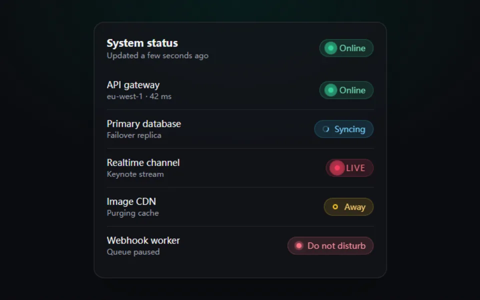
A status badge with a breathing halo: online, busy, away, offline, live, syncing. Color morphs and the label slides when the state changes, and screen readers announce it. Made for service health pages, member lists and live markers.
- React · Motion
- MIT
- shadcnblocks/kibo
- Remix this
Loading preview
Tune
Highlighted lines hold your current values; copies and downloads include them
// SPDX-License-Identifier: MIT// Copyright (c) 2023 — Present shadcnblocks// Source: https://github.com/shadcnblocks/kibo/blob/3d63cdb/packages/status/index.tsx// Modified by Motif; see the item's provenance.import { cn } from '@motif/runtime'import { AnimatePresence, motion, useReducedMotion } from 'motion/react'import type { CSSProperties } from 'react'/* @motif:defaults */export const defaults = { status: 'online', variant: 'soft', size: 'md', radius: 999, pulse: 1.8, spring: { visualDuration: 0.36, bounce: 0.2, }, label: '',}/* @motif:end */export type StatusKind = 'online' | 'busy' | 'away' | 'offline' | 'live' | 'syncing'export type BadgeStatusProps = Partial<typeof defaults> & { className?: string style?: CSSProperties}const STATUSES: Record<StatusKind, { color: string; text: string }> = { online: { color: '#34d399', text: 'Online' }, busy: { color: '#fb7185', text: 'Do not disturb' }, away: { color: '#fbbf24', text: 'Away' }, offline: { color: '#a1a1aa', text: 'Offline' }, live: { color: '#f43f5e', text: 'Live' }, syncing: { color: '#38bdf8', text: 'Syncing' },}const SIZES = { sm: { height: 22, padX: 8, text: 11, dot: 7, gap: 6 }, md: { height: 28, padX: 11, text: 13, dot: 8, gap: 8 }, lg: { height: 36, padX: 15, text: 15, dot: 10, gap: 10 },} as const/** 状态徽章:圆点脉冲、状态切换时颜色变形、文案上下滑动替换;role="status" 会向读屏软件播报变化。 */export function BadgeStatus({ className, style, ...props }: BadgeStatusProps) { const { status, variant, size, radius, pulse, spring, label } = { ...defaults, ...props } const reduced = useReducedMotion() const spec = STATUSES[status as StatusKind] ?? STATUSES.online const kind = (status in STATUSES ? status : 'online') as StatusKind const s = SIZES[size as keyof typeof SIZES] ?? SIZES.md const text = label || spec.text const transition = reduced ? { duration: 0 } : { type: 'spring' as const, visualDuration: spring.visualDuration, bounce: spring.bounce } const pulsing = !reduced && (kind === 'online' || kind === 'live' || kind === 'busy') const dotSolid = kind !== 'away' && kind !== 'offline' return ( <motion.span layout={!reduced} role="status" aria-live="polite" className={cn( 'inline-flex w-fit items-center font-medium whitespace-nowrap select-none', variant === 'soft' && 'border border-[color-mix(in_oklab,var(--sc)_22%,transparent)] bg-[color-mix(in_oklab,var(--sc)_13%,transparent)] text-[color-mix(in_oklab,var(--sc)_78%,var(--foreground))]', variant === 'outline' && 'border border-[color-mix(in_oklab,var(--sc)_55%,transparent)] text-[color-mix(in_oklab,var(--sc)_78%,var(--foreground))]', variant === 'solid' && 'border border-transparent bg-(--sc) text-[color-mix(in_oklab,var(--sc)_18%,black)]', kind === 'live' && 'tracking-[0.08em] uppercase', className, )} initial={false} animate={{ '--sc': spec.color } as never} transition={{ duration: 0.35 }} style={{ height: s.height, paddingInline: s.padX, gap: s.gap, fontSize: s.text, borderRadius: radius, '--sc': spec.color, ...style } as CSSProperties} > <span aria-hidden className="relative grid shrink-0 place-items-center" style={{ width: s.dot + 4, height: s.dot + 4 }}> {pulsing && ( <> <motion.span className="absolute rounded-full bg-(--sc)" style={{ width: s.dot, height: s.dot }} animate={{ scale: [1, kind === 'live' ? 3 : 2.5], opacity: [0.55, 0] }} transition={{ duration: pulse * (kind === 'busy' ? 1.5 : 1), repeat: Infinity, ease: 'easeOut' }} /> {kind === 'live' && ( <motion.span className="absolute rounded-full bg-(--sc)" style={{ width: s.dot, height: s.dot }} animate={{ scale: [1, 3], opacity: [0.4, 0] }} transition={{ duration: pulse, repeat: Infinity, ease: 'easeOut', delay: pulse / 2 }} /> )} </> )} {kind === 'syncing' ? ( <motion.svg viewBox="0 0 16 16" width={s.dot + 4} height={s.dot + 4} fill="none" stroke="currentColor" strokeWidth="2.2" strokeLinecap="round" animate={reduced ? undefined : { rotate: 360 }} transition={{ duration: 0.9, repeat: Infinity, ease: 'linear' }}> <circle cx="8" cy="8" r="5.5" opacity="0.25" /> <path d="M8 2.5a5.5 5.5 0 0 1 5.5 5.5" /> </motion.svg> ) : ( <span className="relative block rounded-full" style={{ width: s.dot, height: s.dot, backgroundColor: dotSolid ? 'var(--sc)' : 'transparent', boxShadow: dotSolid ? '0 0 8px color-mix(in oklab, var(--sc) 70%, transparent)' : 'inset 0 0 0 2px var(--sc)', }} /> )} </span> <span className="relative inline-grid overflow-hidden" style={{ lineHeight: `${s.height - 2}px` }}> <AnimatePresence mode="popLayout" initial={false}> <motion.span key={text} initial={{ opacity: 0, y: reduced ? 0 : '70%', filter: reduced ? 'blur(0px)' : 'blur(3px)' }} animate={{ opacity: 1, y: 0, filter: 'blur(0px)' }} exit={{ opacity: 0, y: reduced ? 0 : '-70%', filter: reduced ? 'blur(0px)' : 'blur(3px)' }} transition={transition} > {text} </motion.span> </AnimatePresence> </span> </motion.span> )}