Warp Tunnel
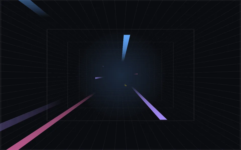
Four grid walls recede into a perspective tunnel while colored beams streak along them from the depths toward the viewer, like jumping to warp. For launch events, campaign pages and heroes that want a sense of speed.
- React · CSS
- MIT
- magicuidesign/magicui
- Remix this
Loading preview
Tune
Highlighted lines hold your current values; copies and downloads include them
// SPDX-License-Identifier: MIT// Copyright (c) Magic UI// Source: https://github.com/magicuidesign/magicui/blob/d7207e5/apps/www/registry/magicui/warp-background.tsx// Modified by Motif; see the item's provenance.import { cn, useFrameLoop } from '@motif/runtime'import { useEffect, useMemo, useRef, type CSSProperties, type ReactNode } from 'react'/* @motif:defaults */export const defaults = { perspective: 100, cellSize: 5, gridColor: '#c7d2fe', gridOpacity: 0.14, beamsPerSide: 4, colors: ['#60a5fa', '#a78bfa', '#f472b6', '#fbbf24'], beamLength: 1, glow: 0.35, speed: 1, seed: 3,}/* @motif:end */export type WarpTunnelProps = Partial<typeof defaults> & { className?: string style?: CSSProperties children?: ReactNode}type Side = 'top' | 'bottom' | 'left' | 'right'interface Beam { side: Side /** 所在的列相对中间一列的偏移;列中心在 50% + lane × cellSize,光束正好填满一列。 */ lane: number /** 长宽比(长 / 宽),上游是 1–10 的随机整数。 */ aspect: number /** 起始相位(0–1 个周期)。 */ phase: number /** 0–1 的随机数,乘以配色数量取颜色。 */ hue: number}const SIDES: Side[] = ['top', 'bottom', 'left', 'right']/** speed = 1 时光束穿过隧道的时长(秒),与上游 beamDuration 默认值相同。 */const DURATION = 3/** * 四面墙:先绕顶边 rotateX(-90deg) 变成伸向远处的平面,左右两面再转 90° 贴到两侧。 * 墙的局部 y 轴就是深度方向:y = 0 在镜头边缘,y 越大越远。尺寸用场景容器的容器查询单位。 */const WALLS: Record<Side, CSSProperties> = { top: { top: 0, left: 0, width: '100cqi', transformOrigin: '50% 0%', transform: 'rotateX(-90deg)', zIndex: 20 }, bottom: { top: '100%', left: 0, width: '100cqi', transformOrigin: '50% 0%', transform: 'rotateX(-90deg)' }, left: { top: 0, left: 0, width: '100cqh', transformOrigin: '0% 0%', transform: 'rotate(90deg) rotateX(-90deg)' }, right: { top: 0, right: 0, width: '100cqh', transformOrigin: '100% 0%', transform: 'rotate(-90deg) rotateX(-90deg)' },}/** * 墙面沿深度方向淡出:远处的 1px 网格线被透视压得比一个像素还细,GPU 采样时会时有时无地闪; * 让它们隐进远处的雾里,光束也像是从雾里钻出来。 */const DEPTH_FADE = 'linear-gradient(to bottom, #000 0%, #000 15%, transparent 65%)'/** 可复现的伪随机数(mulberry32)。 */function createRandom(seed: number) { let state = seed >>> 0 return () => { state = (state + 0x6d2b79f5) >>> 0 let t = state t = Math.imul(t ^ (t >>> 15), t | 1) t ^= t + Math.imul(t ^ (t >>> 7), t | 61) return ((t ^ (t >>> 14)) >>> 0) / 4294967296 }}/** 每面墙均匀分出 beamsPerSide 段(沿用上游的取法),每段里随机挑一列;长度、相位、颜色随机。 */function createBeams(beamsPerSide: number, cellSize: number, seed: number): Beam[] { const rand = createRandom(seed) const cells = Math.floor(100 / cellSize) const step = cells / beamsPerSide return SIDES.flatMap((side) => Array.from({ length: beamsPerSide }, (_, index) => ({ side, lane: Math.floor(index * step + rand() * Math.max(0, step - 1)) - Math.floor(cells / 2), aspect: 1 + Math.floor(rand() * 10), phase: rand(), hue: rand(), })), )}/** #rrggbb 加透明度,转成 rgb() 字符串。 */function withAlpha(hex: string, alpha: number): string { const value = hex.replace('#', '') const channel = (index: number) => parseInt(value.slice(index * 2, index * 2 + 2), 16) return `rgb(${channel(0)} ${channel(1)} ${channel(2)} / ${Math.max(0, Math.min(1, alpha)).toFixed(3)})`}/** 一条四面网格墙围成的透视隧道,彩色光束沿墙面飞向镜头。尺寸由 className 决定,children 叠在隧道之上。 */export function WarpTunnel({ className, style, children, ...props }: WarpTunnelProps) { const options = { ...defaults, ...props } const optionsRef = useRef(options) optionsRef.current = options const hostRef = useRef<HTMLDivElement>(null) const sceneSize = useRef({ width: 0, height: 0 }) const beamRefs = useRef<(HTMLDivElement | null)[]>([]) const lastTime = useRef(0) const beams = useMemo( () => createBeams(Math.max(1, Math.round(options.beamsPerSide)), Math.max(1, options.cellSize), options.seed), [options.beamsPerSide, options.cellSize, options.seed], ) const update = (time: number) => { lastTime.current = time const o = optionsRef.current const { width, height } = sceneSize.current // 墙的深度是 100cqmax;上下墙宽为容器宽,左右墙宽为容器高。 const depth = Math.max(width, height) beams.forEach((beam, index) => { const element = beamRefs.current[index] if (!element) return const wallWidth = beam.side === 'top' || beam.side === 'bottom' ? width : height const length = ((wallWidth * o.cellSize) / 100) * beam.aspect * o.beamLength const progress = (((time / DURATION + beam.phase) % 1) + 1) % 1 // 从隧道深处出发,一直飞到整条光束都越过镜头边缘。 const y = depth - (depth + length) * progress element.style.transform = `translate3d(-50%, ${y.toFixed(1)}px, 0)` }) } const updateRef = useRef(update) updateRef.current = update useEffect(() => { const host = hostRef.current if (!host) return const observer = new ResizeObserver(() => { sceneSize.current = { width: host.clientWidth, height: host.clientHeight } updateRef.current(lastTime.current) }) observer.observe(host) return () => observer.disconnect() }, []) // 光束重新生成或长度变化后,静止状态下也按当前时刻摆好。 useEffect(() => updateRef.current(lastTime.current), [beams, options.beamLength]) useFrameLoop(hostRef, ({ time }) => update(time), { speed: options.speed, reducedMotion: 'static', staticTime: 1.6 }) const { cellSize, gridColor, gridOpacity, colors, glow } = options const line = withAlpha(gridColor, gridOpacity) const cell = `${cellSize}%` // 与上游相同的两层渐变:横线贴着格子顶边,竖线落在格子中缝,光束正好填满两条竖线之间的一列。 const grid = `linear-gradient(${line} 0 1px, transparent 1px ${cell}) 50% -0.5px / ${cell} ${cell}, linear-gradient(90deg, ${line} 0 1px, transparent 1px ${cell}) 50% 50% / ${cell} ${cell}` const palette = colors.length > 0 ? colors : ['#ffffff'] return ( <div ref={hostRef} className={cn('relative isolate overflow-hidden', className)} style={style}> {glow > 0 && ( <div aria-hidden className="pointer-events-none absolute inset-0" style={{ background: `radial-gradient(circle at 50% 50%, ${withAlpha(palette[0]!, glow * 0.55)}, ${withAlpha(palette[0]!, 0)} 32%)` }} /> )} <div aria-hidden className="pointer-events-none absolute inset-0 overflow-hidden" style={{ perspective: `${options.perspective}px`, transformStyle: 'preserve-3d', containerType: 'size', clipPath: 'inset(0)' }} > {SIDES.map((side) => ( <div key={side} className="absolute" style={{ ...WALLS[side], height: '100cqmax', background: grid, maskImage: DEPTH_FADE, WebkitMaskImage: DEPTH_FADE }}> {beams.map((beam, index) => beam.side === side ? ( <div key={index} ref={(element) => { beamRefs.current[index] = element }} className="absolute top-0" style={{ left: `${50 + beam.lane * cellSize}%`, width: cell, // 高度由长宽比决定,与 update 里算行程用的长度一致,每帧只改 transform。 aspectRatio: `1 / ${beam.aspect * options.beamLength}`, // 亮的一头朝向镜头,尾巴向深处淡出。 background: `linear-gradient(${palette[Math.floor(beam.hue * palette.length)]}, transparent)`, willChange: 'transform', }} /> ) : null, )} </div> ))} </div> {children && <div className="relative z-30 h-full w-full">{children}</div>} </div> )}