Toast Stack
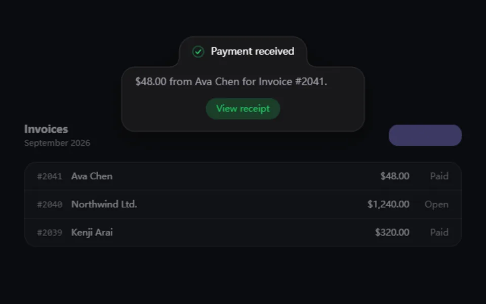
Sonner-style stacking toasts: cards tuck behind the newest one, expand into a list on hover and pause their timers, and swipe away. Supports loading-to-success updates in place, action buttons, six positions and screen-reader announcements.
- React · Motion · CSS
- MIT
- emilkowalski/sonner
- Remix this
Loading preview
Tune
Highlighted lines hold your current values; copies and downloads include them
// SPDX-License-Identifier: MIT// Copyright (c) 2023 Emil Kowalski// Source: https://github.com/emilkowalski/sonner/blob/8e4662b/src/index.tsx// Modified by Motif; see the item's provenance.import { AnimatePresence, motion, useReducedMotion, type PanInfo } from 'motion/react'import { cn } from '@motif/runtime'import { useCallback, useEffect, useRef, useState, type CSSProperties } from 'react'/* @motif:defaults */export const defaults = { position: 'bottom-right', width: 356, gap: 14, visibleToasts: 3, duration: 4, radius: 14, richColors: false, expandOnHover: true, spring: { visualDuration: 0.45, bounce: 0.12, },}/* @motif:end */export type ToastType = 'default' | 'success' | 'error' | 'info' | 'warning' | 'loading'export type ToastData = { id: string title: string description?: string type?: ToastType action?: { label: string; onClick?: () => void } /** 秒;0 表示不自动消失(loading 默认如此)。错误类会自动延长一倍。 */ duration?: number}export type ToastStackProps = Partial<typeof defaults> & { className?: string style?: CSSProperties /** 当前的 toast 列表,新的放在末尾。 */ toasts?: ToastData[] /** 到期、被划走或点了关闭时调用,由调用方把它从列表里移除。 */ onDismiss?: (id: string) => void /** 从外部强制展开或折叠(演示的自动播放用);不传时由悬停和聚焦决定。 */ expanded?: boolean}/** 与 sonner 相同的常量:划走阈值 45px;折叠时后面的卡片每层缩小 5%。 */const SWIPE_THRESHOLD = 45const SCALE_STEP = 0.05const FALLBACK_HEIGHT = 64const ACCENT: Record<string, string> = { success: '#22c55e', error: '#ef4444', info: '#3b82f6', warning: '#f59e0b',}const ICON_PATHS: Record<string, { viewBox: string; d: string }> = { success: { viewBox: '0 0 20 20', d: 'M10 18a8 8 0 100-16 8 8 0 000 16zm3.857-9.809a.75.75 0 00-1.214-.882l-3.483 4.79-1.88-1.88a.75.75 0 10-1.06 1.061l2.5 2.5a.75.75 0 001.137-.089l4-5.5z', }, error: { viewBox: '0 0 20 20', d: 'M18 10a8 8 0 11-16 0 8 8 0 0116 0zm-8-5a.75.75 0 01.75.75v4.5a.75.75 0 01-1.5 0v-4.5A.75.75 0 0110 5zm0 10a1 1 0 100-2 1 1 0 000 2z', }, info: { viewBox: '0 0 20 20', d: 'M18 10a8 8 0 11-16 0 8 8 0 0116 0zm-7-4a1 1 0 11-2 0 1 1 0 012 0zM9 9a.75.75 0 000 1.5h.253a.25.25 0 01.244.304l-.459 2.066A1.75 1.75 0 0010.747 15H11a.75.75 0 000-1.5h-.253a.25.25 0 01-.244-.304l.459-2.066A1.75 1.75 0 009.253 9H9z', }, warning: { viewBox: '0 0 24 24', d: 'M9.401 3.003c1.155-2 4.043-2 5.197 0l7.355 12.748c1.154 2-.29 4.5-2.599 4.5H4.645c-2.309 0-3.752-2.5-2.598-4.5L9.4 3.003zM12 8.25a.75.75 0 01.75.75v3.75a.75.75 0 01-1.5 0V9a.75.75 0 01.75-.75zm0 8.25a.75.75 0 100-1.5.75.75 0 000 1.5z', },}function ToastIcon({ type }: { type: ToastType }) { if (type === 'loading') { return ( <span className="mts-spinner" aria-hidden> <span className="mts-bars"> {Array.from({ length: 12 }, (_, i) => ( <i key={i} className="mts-bar" style={{ '--i': i } as CSSProperties} /> ))} </span> </span> ) } const icon = ICON_PATHS[type] if (!icon) return null return ( <svg viewBox={icon.viewBox} width="20" height="20" fill={ACCENT[type]} aria-hidden fillRule="evenodd" clipRule="evenodd"> <path d={icon.d} /> </svg> )}type ItemProps = { toast: ToastData index: number count: number offset: number frontHeight: number height: number | undefined expanded: boolean visible: boolean isTop: boolean horizontal: 'left' | 'center' | 'right' gap: number radius: number richColors: boolean reduced: boolean spring: { visualDuration: number; bounce: number } onHeight: (id: string, height: number) => void onDismiss: (id: string) => void onDragState: (dragging: boolean) => void}function ToastItem({ toast, index, count, offset, frontHeight, height, expanded, visible, isTop, horizontal, gap, radius, richColors, reduced, spring, onHeight, onDismiss, onDragState }: ItemProps) { const contentRef = useRef<HTMLDivElement>(null) const type = toast.type ?? 'default' const sign = isTop ? 1 : -1 const front = index === 0 const axis = horizontal === 'center' ? 'y' : 'x' // 划走的方向:靠右的往右、靠左的往左;居中的往屏幕外沿方向 const swipeSign = axis === 'x' ? (horizontal === 'right' ? 1 : -1) : isTop ? -1 : 1 useEffect(() => { const element = contentRef.current if (!element) return // +2:卡片有 1px 边框,内容高度加上边框才是卡片总高 const report = () => onHeight(toast.id, element.offsetHeight + 2) report() const observer = new ResizeObserver(report) observer.observe(element) return () => observer.disconnect() }, [toast.id, onHeight]) const collapsedShape = !expanded && !front const targetY = expanded ? sign * offset : sign * index * gap const scale = expanded || reduced ? 1 : 1 - index * SCALE_STEP const shownHeight = collapsedShape ? frontHeight : (height ?? 'auto') const enterOffset = reduced ? 0 : sign * ((height ?? FALLBACK_HEIGHT) + 32) const onDragEnd = (_: PointerEvent | MouseEvent | TouchEvent, info: PanInfo) => { onDragState(false) const amount = (axis === 'x' ? info.offset.x : info.offset.y) * swipeSign const velocity = (axis === 'x' ? info.velocity.x : info.velocity.y) * swipeSign if (amount >= SWIPE_THRESHOLD || velocity > 300) onDismiss(toast.id) } return ( <motion.li layout={false} initial={{ opacity: 0, y: targetY + enterOffset, scale }} animate={{ opacity: visible ? 1 : 0, y: targetY, scale }} exit={{ opacity: 0, ...(reduced ? {} : axis === 'x' ? { x: swipeSign * 120 } : { y: targetY + swipeSign * 60 }), transition: { duration: reduced ? 0.15 : 0.28, ease: [0.4, 0, 1, 1] }, }} transition={reduced ? { duration: 0.15 } : { type: 'spring', visualDuration: spring.visualDuration, bounce: spring.bounce }} className="absolute inset-x-0 list-none" style={{ [isTop ? 'top' : 'bottom']: 0, zIndex: count - index, transformOrigin: isTop ? 'top center' : 'bottom center', pointerEvents: visible ? 'auto' : 'none', }} > <motion.div drag={axis} dragSnapToOrigin dragElastic={0.6} dragConstraints={{ left: 0, right: 0, top: 0, bottom: 0 }} onDragStart={() => onDragState(true)} onDragEnd={onDragEnd} role={type === 'error' ? 'alert' : 'status'} aria-live={type === 'error' ? 'assertive' : 'polite'} aria-atomic="true" animate={{ height: shownHeight }} transition={reduced ? { duration: 0.15 } : { type: 'spring', visualDuration: spring.visualDuration, bounce: 0 }} className={cn('mts-card group relative overflow-hidden border text-[13px] shadow-[0_8px_24px_-6px_rgb(0_0_0/0.35),0_2px_6px_rgb(0_0_0/0.18)]', axis === 'x' ? 'touch-pan-y' : 'touch-pan-x')} style={{ borderRadius: radius, background: richColors && ACCENT[type] ? `color-mix(in oklab, ${ACCENT[type]} 14%, var(--popover))` : 'var(--popover)', borderColor: richColors && ACCENT[type] ? `color-mix(in oklab, ${ACCENT[type]} 38%, var(--border))` : 'var(--border)', color: 'var(--popover-foreground)', }} > <div ref={contentRef} className="flex items-start gap-3 p-4 transition-opacity duration-200" style={{ opacity: collapsedShape ? 0 : 1 }}> {type !== 'default' && ( <span className="mt-px grid size-5 shrink-0 place-items-center" style={{ color: ACCENT[type] }}> <ToastIcon type={type} /> </span> )} <div className="min-w-0 flex-1"> <p className="font-medium leading-5">{toast.title}</p> {toast.description && <p className="mt-0.5 leading-[18px] text-muted-foreground">{toast.description}</p>} </div> {toast.action && ( <button type="button" onClick={() => { toast.action?.onClick?.() onDismiss(toast.id) }} className="shrink-0 self-center rounded-lg bg-foreground px-2.5 py-1 text-xs font-medium text-background outline-none focus-visible:ring-2 focus-visible:ring-ring" > {toast.action.label} </button> )} </div> <button type="button" aria-label="Dismiss notification" onClick={() => onDismiss(toast.id)} className="absolute right-2 top-2 grid size-5 place-items-center rounded-full bg-popover/90 text-muted-foreground opacity-0 outline-none hover:text-foreground focus-visible:opacity-100 focus-visible:ring-2 focus-visible:ring-ring group-hover:opacity-100" style={{ display: toast.action ? 'none' : undefined }} > <svg viewBox="0 0 12 12" width="10" height="10" fill="none" stroke="currentColor" strokeWidth="1.6" strokeLinecap="round" aria-hidden> <path d="M2 2l8 8M10 2l-8 8" /> </svg> </button> </motion.div> </motion.li> )}/** * sonner 风格的 toast 堆叠:折叠时后面的卡片缩小并露出一线,悬停或聚焦时展开成列表, * 悬停、聚焦、拖动、切走标签页时暂停计时,可以向外划走,出现和消失都是弹簧。 * 父元素需要 position: relative(demo 里就是这样),容器绝对定位在它的角落。 */export function ToastStack({ className, style, toasts = [], onDismiss, expanded: forcedExpanded, ...props }: ToastStackProps) { const { position, width, gap, visibleToasts, duration, radius, expandOnHover, richColors, spring } = { ...defaults, ...props } const reduced = Boolean(useReducedMotion()) const [hovered, setHovered] = useState(false) const [focused, setFocused] = useState(false) const [dragging, setDragging] = useState(0) const [heights, setHeights] = useState<Record<string, number>>({}) const expanded = forcedExpanded ?? (expandOnHover && (hovered || focused)) const paused = expanded || hovered || focused || dragging > 0 const isTop = position.startsWith('top') const horizontal = (position.endsWith('left') ? 'left' : position.endsWith('right') ? 'right' : 'center') as 'left' | 'center' | 'right' const dismiss = useCallback( (id: string) => { onDismiss?.(id) }, [onDismiss], ) const onHeight = useCallback((id: string, height: number) => { setHeights((current) => (current[id] === height ? current : { ...current, [id]: height })) }, []) // 计时:用 rAF 和 performance.now,暂停时不走;切到后台时也不走。 // 同一条 toast 的类型变化(例如 loading → success)会重新开始计时。 const listRef = useRef(toasts) listRef.current = toasts const pausedRef = useRef(paused) pausedRef.current = paused const clock = useRef(new Map<string, { elapsed: number; type: string; fired: boolean }>()) const dismissRef = useRef(dismiss) dismissRef.current = dismiss const baseDuration = duration useEffect(() => { let frame = 0 let last = performance.now() const tick = (now: number) => { const dt = Math.min((now - last) / 1000, 0.1) last = now const alive = new Set<string>() for (const toast of listRef.current) { alive.add(toast.id) const type = toast.type ?? 'default' let entry = clock.current.get(toast.id) if (!entry || entry.type !== type) { entry = { elapsed: 0, type, fired: false } clock.current.set(toast.id, entry) } const seconds = toast.duration ?? (type === 'loading' ? 0 : type === 'error' ? baseDuration * 2 : baseDuration) if (seconds <= 0 || entry.fired) continue if (!pausedRef.current && !document.hidden) entry.elapsed += dt if (entry.elapsed >= seconds) { entry.fired = true dismissRef.current(toast.id) } } for (const id of clock.current.keys()) if (!alive.has(id)) clock.current.delete(id) frame = requestAnimationFrame(tick) } frame = requestAnimationFrame(tick) return () => cancelAnimationFrame(frame) }, [baseDuration]) // 新的在最前面(index 0) const ordered = [...toasts].reverse() const frontHeight = heights[ordered[0]?.id ?? ''] ?? FALLBACK_HEIGHT const offsets: number[] = [] let running = 0 ordered.forEach((toast, i) => { offsets[i] = running running += (heights[toast.id] ?? FALLBACK_HEIGHT) + gap }) const shown = Math.min(ordered.length, visibleToasts) const stackHeight = expanded ? Math.max(0, (offsets[shown - 1] ?? 0) + (heights[ordered[shown - 1]?.id ?? ''] ?? FALLBACK_HEIGHT)) : frontHeight + Math.max(0, shown - 1) * gap return ( <section aria-label="Notifications" className={cn('pointer-events-none absolute z-50 p-6', className)} style={{ width: width + 48, maxWidth: '100%', [isTop ? 'top' : 'bottom']: 0, ...(horizontal === 'left' ? { left: 0 } : horizontal === 'right' ? { right: 0 } : { left: '50%', translate: '-50% 0' }), ...style, }} > <ol className="pointer-events-auto relative m-0 list-none p-0" style={{ height: ordered.length ? stackHeight : 0, transition: reduced ? undefined : 'height 0.3s cubic-bezier(0.22, 1, 0.36, 1)' }} onPointerEnter={() => setHovered(true)} onPointerLeave={() => setHovered(false)} onFocus={() => setFocused(true)} onBlur={(event) => { if (!event.currentTarget.contains(event.relatedTarget as Node | null)) setFocused(false) }} > <AnimatePresence initial={false}> {ordered.map((toast, index) => ( <ToastItem key={toast.id} toast={toast} index={index} count={ordered.length} offset={offsets[index] ?? 0} frontHeight={frontHeight} height={heights[toast.id]} expanded={expanded} visible={index < visibleToasts} isTop={isTop} horizontal={horizontal} gap={gap} radius={radius} richColors={richColors} reduced={reduced} spring={spring} onHeight={onHeight} onDismiss={dismiss} onDragState={(isDragging) => setDragging((n) => Math.max(0, n + (isDragging ? 1 : -1)))} /> ))} </AnimatePresence> </ol> </section> )}