Morphing Popover
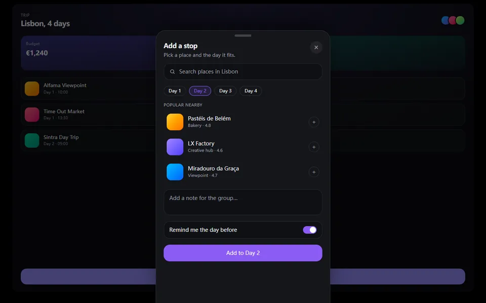
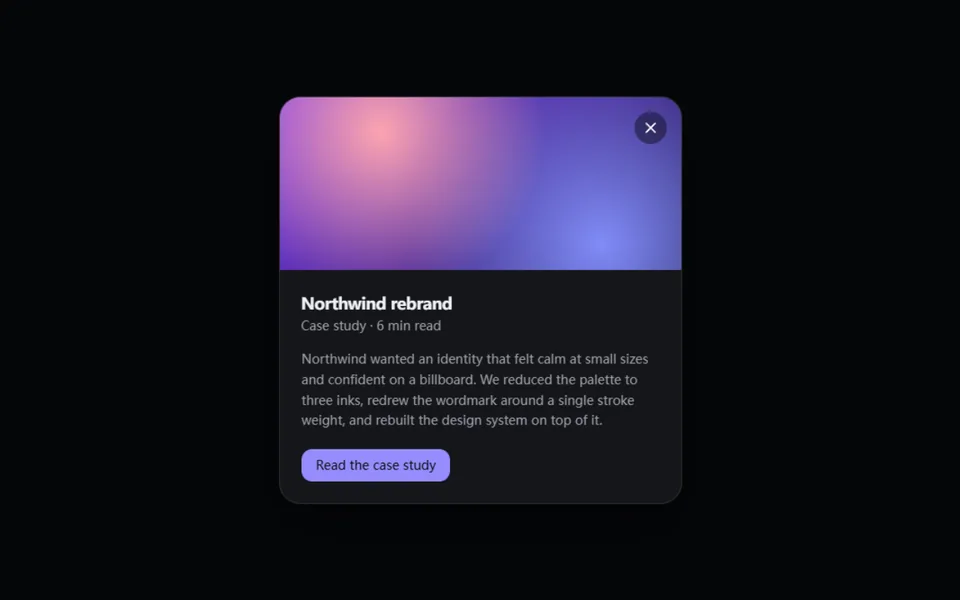
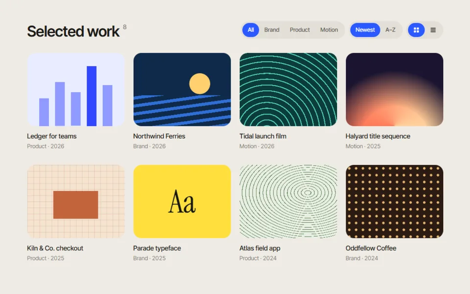
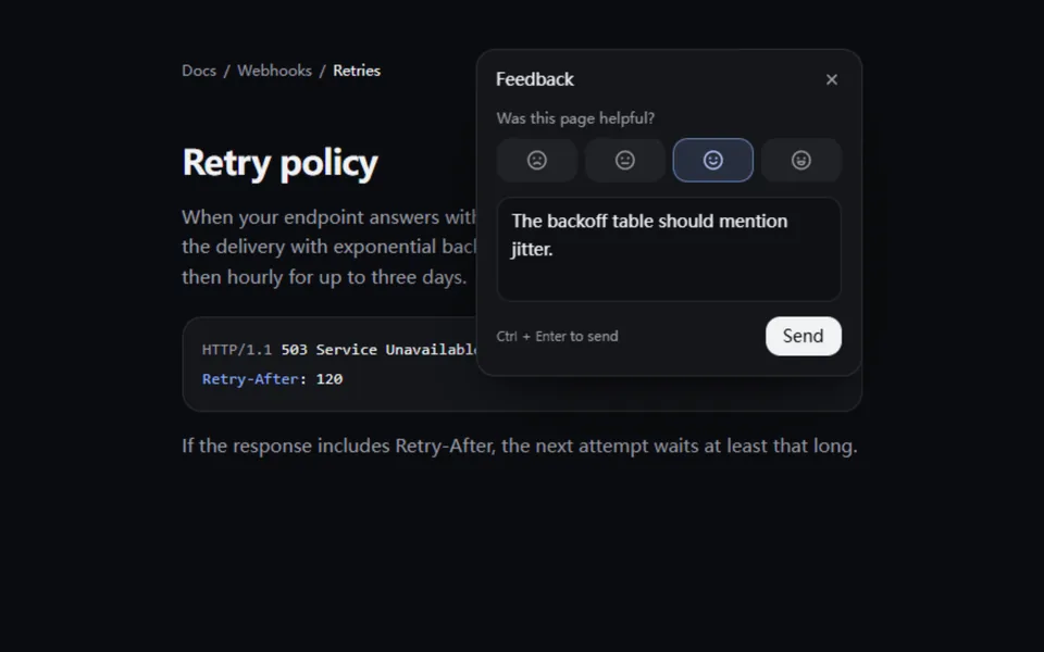
The button itself springs open into a small panel, its label riding along while the content rises in, and folds back into the button on close. It opens in place without covering the page; Esc, clicking outside or tabbing away closes it, and focus goes in and comes back. For feedback, quick notes, sharing and filters.
- React · Motion
- MIT
- ibelick/motion-primitives
- Remix this
Loading preview
Tune
Highlighted lines hold your current values; copies and downloads include them
// SPDX-License-Identifier: MIT// Copyright (c) 2024 ibelick// Source: https://github.com/ibelick/motion-primitives/blob/120f64f/components/core/morphing-popover.tsx// Modified by Motif; see the item's provenance.import { AnimatePresence, MotionConfig, motion, useReducedMotion, type Transition, type Variants } from 'motion/react'import { cn } from '@motif/runtime'import { createContext, useCallback, useContext, useEffect, useId, useMemo, useRef, useState, type CSSProperties, type FocusEvent as ReactFocusEvent, type ReactNode, type RefObject,} from 'react'/* @motif:defaults */export const defaults = { spring: { visualDuration: 0.42, bounce: 0.12, }, contentEffect: 'rise', align: 'end', radius: 16, triggerRadius: 18, elevation: 'lifted', closeOnOutsideClick: true,}/* @motif:end */type PopoverOptions = typeof defaultstype Intent = { fromUser: boolean; restore: boolean }type PopoverContextValue = { isOpen: boolean /** fromUser:用户操作触发时才把焦点移进面板;restore:关上后焦点回到按钮(Esc、关闭按钮)。 */ setOpen: (open: boolean, intent?: Partial<Intent>) => void uniqueId: string rootRef: RefObject<HTMLDivElement | null> triggerRef: RefObject<HTMLButtonElement | null> options: PopoverOptions intent: RefObject<Intent>}const PopoverContext = createContext<PopoverContextValue | null>(null)// 标签只有在面板里才带 id(面板用它命名自己),按钮里的同名标签不带,避免重复 id。const InContentContext = createContext(false)function usePopover() { const context = useContext(PopoverContext) if (!context) throw new Error('MorphingPopover parts must be used inside <MorphingPopover>') return context}const FOCUSABLE = 'textarea, input, select, button, [href], [tabindex]:not([tabindex="-1"])'const ALIGN: Record<string, string> = { start: 'justify-start', center: 'justify-center', end: 'justify-end' }// 阴影写在 style 里:形变时 motion 会按缩放修正 boxShadow,不会被拉扁。const ELEVATION: Record<string, string> = { flat: 'none', soft: '0 10px 30px -14px rgb(0 0 0 / 0.55)', lifted: '0 28px 70px -24px rgb(0 0 0 / 0.8), 0 8px 20px -8px rgb(0 0 0 / 0.45)',}export type MorphingPopoverProps = Partial<typeof defaults> & { children: ReactNode /** 受控:是否展开。 */ open?: boolean defaultOpen?: boolean onOpenChange?: (open: boolean) => void className?: string style?: CSSProperties}/** * 根组件:提供状态和弹簧。按钮和面板共用同一个 layoutId,所以是按钮本身长成面板; * 面板绝对定位在按钮所在的位置,按 align 贴住按钮的一条边,往另一边长。 */export function MorphingPopover({ children, open, defaultOpen = false, onOpenChange, className, style, ...props }: MorphingPopoverProps) { const resolved = { ...defaults, ...props } const { contentEffect, align, radius, triggerRadius, elevation, closeOnOutsideClick } = resolved const { visualDuration, bounce } = resolved.spring // 每次渲染都会新建 resolved,按具体取值缓存 options,避免上下文无谓变化。 const options = useMemo<PopoverOptions>( () => ({ spring: { visualDuration, bounce }, contentEffect, align, radius, triggerRadius, elevation, closeOnOutsideClick }), [visualDuration, bounce, contentEffect, align, radius, triggerRadius, elevation, closeOnOutsideClick], ) const reduced = Boolean(useReducedMotion()) const [inner, setInner] = useState(defaultOpen) const isOpen = open ?? inner const uniqueId = useId() const rootRef = useRef<HTMLDivElement>(null) const triggerRef = useRef<HTMLButtonElement>(null) const intent = useRef<Intent>({ fromUser: false, restore: false }) const setOpen = useCallback( (next: boolean, how: Partial<Intent> = {}) => { intent.current = { fromUser: how.fromUser ?? false, restore: how.restore ?? false } setInner(next) onOpenChange?.(next) }, [onOpenChange], ) // 点外面关闭:只在展开时监听;焦点留在用户点到的地方,不拉回按钮。 useEffect(() => { if (!isOpen || !closeOnOutsideClick) return const onPointerDown = (event: PointerEvent) => { if (!rootRef.current?.contains(event.target as Node)) setOpen(false, { fromUser: true }) } document.addEventListener('pointerdown', onPointerDown) return () => document.removeEventListener('pointerdown', onPointerDown) }, [isOpen, closeOnOutsideClick, setOpen]) // Esc 关闭并把焦点还给按钮。 useEffect(() => { if (!isOpen) return const onKeyDown = (event: KeyboardEvent) => { if (event.key === 'Escape') setOpen(false, { fromUser: true, restore: true }) } document.addEventListener('keydown', onKeyDown) return () => document.removeEventListener('keydown', onKeyDown) }, [isOpen, setOpen]) const context = useMemo(() => ({ isOpen, setOpen, uniqueId, rootRef, triggerRef, options, intent }), [isOpen, setOpen, uniqueId, options]) const transition: Transition = reduced ? { duration: 0.15 } : { type: 'spring', visualDuration, bounce } return ( <PopoverContext.Provider value={context}> <MotionConfig transition={transition} reducedMotion="user"> {/* 面板是绝对定位、没有 left/right 的子元素:它的静态位置按 justify-content 贴住按钮的起点、中线或终点。 */} <div ref={rootRef} className={cn('relative inline-flex items-start', ALIGN[align] ?? ALIGN.end, className)} style={style}> {children} </div> </MotionConfig> </PopoverContext.Provider> )}export type MorphingPopoverTriggerProps = { children: ReactNode className?: string style?: CSSProperties 'aria-label'?: string}/** 触发按钮,也是形变的起点。面板打开时它被盖住并设为 inert,Tab 不会走到看不见的按钮上。 */export function MorphingPopoverTrigger({ children, className, style, 'aria-label': ariaLabel }: MorphingPopoverTriggerProps) { const { isOpen, setOpen, uniqueId, triggerRef, options } = usePopover() return ( <motion.button ref={triggerRef} type="button" layoutId={`${uniqueId}-surface`} aria-label={ariaLabel} aria-haspopup="dialog" aria-expanded={isOpen} aria-controls={isOpen ? `${uniqueId}-content` : undefined} inert={isOpen} onClick={() => setOpen(!isOpen, { fromUser: true })} className={cn('relative cursor-pointer outline-none focus-visible:ring-2 focus-visible:ring-ring focus-visible:ring-offset-2 focus-visible:ring-offset-background', className)} style={{ borderRadius: options.triggerRadius, ...style }} > {children} </motion.button> )}export type MorphingPopoverContentProps = { children: ReactNode className?: string style?: CSSProperties}/** 面板:非模态对话框。用户打开时焦点进来([data-autofocus] 或第一个可聚焦元素),焦点离开面板就关上。 */export function MorphingPopoverContent({ children, className, style }: MorphingPopoverContentProps) { const { isOpen, setOpen, uniqueId, rootRef, triggerRef, options, intent } = usePopover() const contentRef = useRef<HTMLDivElement>(null) useEffect(() => { if (!isOpen) return if (intent.current.fromUser) { const panel = contentRef.current const target = panel?.querySelector<HTMLElement>('[data-autofocus]') ?? panel?.querySelector<HTMLElement>(FOCUSABLE) target?.focus({ preventScroll: true }) } const trigger = triggerRef.current // 关上时读「最新」的意图(Esc / 关闭按钮才还焦点),所以在清理函数里取。 const current = intent return () => { if (current.current.restore) trigger?.focus({ preventScroll: true }) } }, [isOpen, intent, triggerRef]) const onBlur = (event: ReactFocusEvent<HTMLDivElement>) => { const next = event.relatedTarget as Node | null // relatedTarget 为空是点到了不可聚焦的地方,交给点外面的逻辑处理。 if (next && !rootRef.current?.contains(next)) setOpen(false, { fromUser: true }) } return ( <AnimatePresence> {isOpen && ( <motion.div ref={contentRef} key="content" layoutId={`${uniqueId}-surface`} id={`${uniqueId}-content`} role="dialog" aria-labelledby={`${uniqueId}-label`} onBlur={onBlur} className={cn('absolute top-0 z-50 overflow-hidden', className)} style={{ borderRadius: options.radius, boxShadow: ELEVATION[options.elevation] ?? ELEVATION.soft, ...style }} > {/* 带 layout 的包裹层会被 motion 按面板的缩放反向修正,形变过程中内容不会被压扁。 */} <motion.div layout="position"> <InContentContext.Provider value>{children}</InContentContext.Provider> </motion.div> </motion.div> )} </AnimatePresence> )}const BODY: Record<string, Variants> = { rise: { hidden: { opacity: 0, y: 8, transition: { duration: 0.1 } }, visible: { opacity: 1, y: 0, transition: { opacity: { duration: 0.24, delay: 0.1 }, y: { type: 'spring', visualDuration: 0.4, bounce: 0, delay: 0.06 } } }, }, fade: { hidden: { opacity: 0, transition: { duration: 0.1 } }, visible: { opacity: 1, transition: { duration: 0.24, delay: 0.1 } }, }, blur: { hidden: { opacity: 0, filter: 'blur(6px)', transition: { duration: 0.1 } }, visible: { opacity: 1, filter: 'blur(0px)', transition: { duration: 0.3, delay: 0.08 } }, },}export type MorphingPopoverBodyProps = { children: ReactNode; className?: string }/** 面板主体:在外框开始长大之后才浮现(rise / fade / blur),关上时先淡出。 */export function MorphingPopoverBody({ children, className }: MorphingPopoverBodyProps) { const { options } = usePopover() return ( <motion.div className={className} variants={BODY[options.contentEffect] ?? BODY.fade} initial="hidden" animate="visible" exit="hidden"> {children} </motion.div> )}export type MorphingPopoverLabelProps = { children: ReactNode; className?: string }/** 按钮和面板里各放一个同样的文字,它会从按钮上的位置滑到面板标题的位置;面板里的那个也是对话框的名字。 */export function MorphingPopoverLabel({ children, className }: MorphingPopoverLabelProps) { const { uniqueId } = usePopover() const inContent = useContext(InContentContext) return ( <motion.span layoutId={`${uniqueId}-label`} id={inContent ? `${uniqueId}-label` : undefined} className={cn('inline-block whitespace-nowrap', className)}> {children} </motion.span> )}export type MorphingPopoverCloseProps = { children?: ReactNode; className?: string; 'aria-label'?: string }/** 关闭按钮:关上后焦点回到触发按钮。 */export function MorphingPopoverClose({ children, className, 'aria-label': ariaLabel = 'Close' }: MorphingPopoverCloseProps) { const { setOpen } = usePopover() return ( <motion.button type="button" aria-label={children ? undefined : ariaLabel} onClick={() => setOpen(false, { fromUser: true, restore: true })} initial={{ opacity: 0, scale: 0.8 }} animate={{ opacity: 1, scale: 1, transition: { delay: 0.1 } }} exit={{ opacity: 0, transition: { duration: 0.08 } }} className={cn('grid cursor-pointer place-items-center outline-none focus-visible:ring-2 focus-visible:ring-ring', !children && 'size-7 rounded-full text-muted-foreground hover:bg-foreground/5 hover:text-foreground', className)} > {children ?? ( <svg viewBox="0 0 16 16" className="size-3.5" fill="none" stroke="currentColor" strokeWidth="1.8" strokeLinecap="round" aria-hidden> <path d="m4 4 8 8M12 4l-8 8" /> </svg> )} </motion.button> )}