Glare Hover
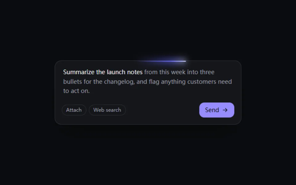
Hover and a diagonal glare sweeps across the card, like a light catching a laminated pass. Angle, size, color and speed are adjustable. Suits membership cards, tickets and product shots that should feel glossy.
- React · CSS
- MIT
- magicuidesign/magicui
- Remix this

Loading preview
Tune
Highlighted lines hold your current values; copies and downloads include them
// SPDX-License-Identifier: MIT// Copyright (c) Magic UI// Source: https://github.com/magicuidesign/magicui/blob/d7207e5/apps/www/registry/magicui/glare-hover.tsx// Modified by Motif; see the item's provenance.import { cn, cssVars } from '@motif/runtime'import type { ComponentProps } from 'react'/* @motif:defaults */export const defaults = { color: '#ffffff', opacity: 0.45, angle: -45, size: 250, radius: 18, duration: 800, playOnce: true,}/* @motif:end */export type GlareHoverProps = Partial<typeof defaults> & Omit<ComponentProps<'div'>, keyof typeof defaults> & { /** 强制显示悬停状态(演示的自动播放用);真实悬停和键盘聚焦照常生效。 */ active?: boolean }/** #rgb / #rrggbb 加上透明度,转成 rgba()。 */function withAlpha(hex: string, alpha: number): string { let value = hex.replace('#', '') if (/^[0-9a-f]{3}$/i.test(value)) value = value.replace(/./g, (c) => c + c) if (!/^[0-9a-f]{6}/i.test(value)) return hex const n = Number.parseInt(value.slice(0, 6), 16) return `rgba(${(n >> 16) & 255}, ${(n >> 8) & 255}, ${n & 255}, ${alpha})`}/** * 悬停时一道斜向的反光从卡片上扫过。反光是一块 size% 大小的渐变,悬停时从右下角外侧平移到左上角外侧, * 只动 transform。包在任何卡片、图片外面即可;圆角用 radius 或 className 设置。 */export function GlareHover({ className, style, children, active, ...props }: GlareHoverProps) { const { color, opacity, angle, size, duration, playOnce, radius, ...rest } = { ...defaults, ...props } // 上游的 background-position 从 -100% 走到 100%:换算成渐变块自身尺寸的百分比。 const scale = size / 100 const shift = ((scale - 1) / scale) * 100 return ( <div {...rest} data-active={active ? '' : undefined} data-play-once={playOnce ? '' : undefined} className={cn('mgh relative isolate overflow-hidden', className)} style={cssVars( { '--mgh-angle': `${angle}deg`, '--mgh-color': withAlpha(color, opacity), '--mgh-size': `${size}%`, '--mgh-from': `${shift}%`, '--mgh-to': `${-shift}%`, '--mgh-duration': `${duration}ms`, }, { borderRadius: radius, ...style }, )} > {children} <span aria-hidden className="mgh-glare" /> </div> )}