Card Spread
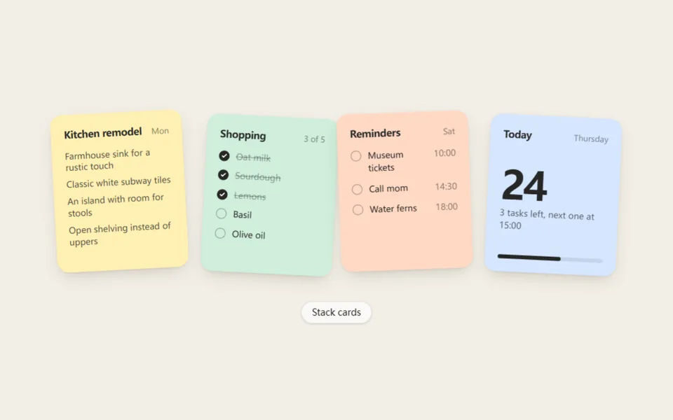
Four paper-like cards sit in a loose stack, then fan out into a row with a springy throw and gather back on the next click. On narrow screens the row overlaps instead of overflowing. Made for notes, to-dos, agendas and mood boards.
- React · Motion
- MIT
- codse/animata
- Remix this
Loading preview
Tune
Highlighted lines hold your current values; copies and downloads include them
// SPDX-License-Identifier: MIT// Copyright (c) Animata// Source: https://github.com/codse/animata/blob/36674e4/animata/card/card-spread.tsx// Modified by Motif; see the item's provenance.import { cn, usePrefersReducedMotion } from '@motif/runtime'import { motion } from 'motion/react'import { Children, useEffect, useRef, useState, type CSSProperties, type ReactNode } from 'react'/* @motif:defaults */export const defaults = { tints: ['#fff0b3', '#cfeedb', '#ffd8c4', '#d6e6ff'], cardWidth: 200, gap: 16, radius: 18, tilt: 3, lift: 14, spring: { visualDuration: 0.5, bounce: 0.28, },}/* @motif:end */export type CardSpreadProps = Partial<typeof defaults> & { className?: string style?: CSSProperties /** 每个子元素是一张卡片的内容;卡片的底色、圆角和阴影由组件提供。 */ children?: ReactNode /** 受控:是否展开。不传则由组件自己的按钮控制。 */ open?: boolean defaultOpen?: boolean onOpenChange?: (open: boolean) => void /** 是否显示「展开 / 收起」按钮。 */ showToggle?: boolean labels?: { spread: string; stack: string }}// 收起时每张卡的小角度(乘以 tilt 的一半):像随手叠起来的一摞,不是死板的一条线。const DECK_ROTATION = [-1, 0.7, -0.5, 1]// 展开时依次交错倾斜,奇偶相反。const FAN_ROTATION = [-1, 1, -0.7, 0.9]/** 一摞卡片,点按钮展开成一排,再收回去。展开后指针经过的卡片会抬起。宽度不够时展开的卡片会互相叠压,不会溢出。 */export function CardSpread({ className, style, children, open, defaultOpen = false, onOpenChange, showToggle = true, labels = { spread: 'Spread cards', stack: 'Stack cards' }, ...props }: CardSpreadProps) { const { cardWidth, gap, tilt, lift, radius, tints, spring } = { ...defaults, ...props } const reduced = usePrefersReducedMotion() const [inner, setInner] = useState(defaultOpen) const expanded = open ?? inner const cards = Children.toArray(children) const count = cards.length const rootRef = useRef<HTMLDivElement>(null) const [width, setWidth] = useState(0) useEffect(() => { const root = rootRef.current if (!root) return const observer = new ResizeObserver(() => setWidth(root.clientWidth)) observer.observe(root) setWidth(root.clientWidth) return () => observer.disconnect() }, []) // 卡片中心之间的间距:够宽时是 卡宽 + 间隙;不够宽时收紧,让整排刚好放进容器。 const full = cardWidth + gap const step = count > 1 && width > 0 ? Math.min(full, Math.max(cardWidth * 0.3, (width - cardWidth - 24) / (count - 1))) : full const center = (count - 1) / 2 const toggle = () => { const next = !expanded if (open === undefined) setInner(next) onOpenChange?.(next) } const transition = reduced ? { duration: 0 } : { type: 'spring' as const, visualDuration: spring.visualDuration, bounce: spring.bounce } return ( <div ref={rootRef} className={cn('flex flex-col items-center gap-6', className)} style={style}> <div className="grid w-full justify-items-center py-6" style={{ gridTemplateColumns: '100%' }}> {cards.map((card, index) => { const x = expanded ? (index - center) * step : 0 const rotate = expanded ? FAN_ROTATION[index % FAN_ROTATION.length]! * tilt : DECK_ROTATION[index % DECK_ROTATION.length]! * tilt * 0.5 const y = expanded ? (index % 2 === 1 ? 6 : 0) : -index * 2 return ( <motion.div key={index} className="[grid-area:1/1]" style={{ zIndex: index + 1, transformOrigin: '50% 100%' }} initial={false} animate={{ x, y, rotate }} transition={transition} > <motion.div className="aspect-[5/6] overflow-hidden text-neutral-800" style={{ width: cardWidth, borderRadius: radius, backgroundColor: tints[index % tints.length], boxShadow: '0 1px 2px rgb(40 30 10 / 0.08), 0 10px 24px -8px rgb(40 30 10 / 0.22)', }} whileHover={reduced ? undefined : { y: expanded ? -lift : -lift * 0.35 }} transition={{ type: 'spring', visualDuration: 0.25, bounce: 0.2 }} > {card} </motion.div> </motion.div> ) })} </div> {showToggle && ( <button type="button" onClick={toggle} aria-pressed={expanded} className="rounded-full border border-black/10 bg-white/70 px-4 py-1.5 text-sm font-medium text-neutral-800 shadow-sm backdrop-blur-sm select-none hover:bg-white focus-visible:outline-2 focus-visible:outline-offset-2 focus-visible:outline-neutral-800" > {expanded ? labels.stack : labels.spread} </button> )} </div> )}