Animated List
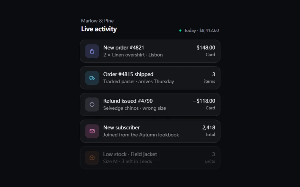
New entries spring in at the top while older ones slide down and the oldest fades out; hovering or focusing pauses the feed so it can be read. Replay a scripted set on a cadence or feed it live data. For order streams, notification centers and the "happening now" strip on a landing page.
- React · Motion
- MIT
- magicuidesign/magicui
- Remix this
Loading preview
Tune
Highlighted lines hold your current values; copies and downloads include them
// SPDX-License-Identifier: MIT// Copyright (c) Magic UI// Source: https://github.com/magicuidesign/magicui/blob/d7207e5/apps/www/registry/magicui/animated-list.tsx// Modified by Motif; see the item's provenance.import { AnimatePresence, MotionConfig, motion, useReducedMotion, type TargetAndTransition, type Transition } from 'motion/react'import { cn, useFrameLoop } from '@motif/runtime'import { Children, createContext, isValidElement, useContext, useMemo, useRef, useState, type CSSProperties, type ReactElement, type ReactNode } from 'react'/* @motif:defaults */export const defaults = { interval: 1.5, entrance: 'pop', spring: { visualDuration: 0.45, bounce: 0.18, }, maxItems: 5, gap: 10, radius: 16, fade: true, pauseOnHover: true, loop: true,}/* @motif:end */export type AnimatedListProps = Partial<typeof defaults> & { /** 带 key 的条目。回放模式按时间先后排(先出现的在前);实时模式按最新在前排。 */ children: ReactNode /** 实时模式:children 就是当前的列表(最新在前),之后新出现的 key 从顶部弹入。默认是回放模式:每隔 interval 秒放出一条。 */ live?: boolean /** 回放模式一开始就显示几条(不播入场动画),设成 maxItems 就是一上来列表就是满的。 */ initialCount?: number /** 回放模式下第一条新条目出现前等多久(秒),默认等于 interval。 */ delay?: number className?: string style?: CSSProperties 'aria-label'?: string}type RowState = { index: number; count: number }const ListContext = createContext({ radius: 16 })const RowContext = createContext<RowState>({ index: 0, count: 1 })/** 当前行在列表里的位置:index 0 是最新的一条。自定义行组件可以用它做「新」标记。 */export function useAnimatedListRow(): RowState { return useContext(RowContext)}// 入场的起始状态。pop 沿用上游:从顶边长出来(transformOrigin 在顶部)。const ENTER: Record<string, TargetAndTransition> = { pop: { opacity: 0, scale: 0.6 }, slide: { opacity: 0, y: -28 }, blur: { opacity: 0, scale: 0.97, filter: 'blur(10px)' },}/** * 动态列表:新条目从顶部弹入,其余的用 layout 动画下移,超出 maxItems 的从底部退场。 * 回放的节奏由 useFrameLoop 推进(离屏、切到后台时暂停,截图时钟下可复现),悬停或聚焦时暂停。 */export function AnimatedList({ children, live = false, initialCount = 1, delay, className, style, 'aria-label': ariaLabel = 'Live activity', ...props }: AnimatedListProps) { const { interval, entrance, spring, maxItems, gap, radius, fade, pauseOnHover, loop } = { ...defaults, ...props } const reduced = Boolean(useReducedMotion()) const hostRef = useRef<HTMLDivElement>(null) const items = useMemo(() => Children.toArray(children).filter(isValidElement) as ReactElement[], [children]) const count = items.length const start = Math.max(0, Math.min(initialCount, count) - 1) const [step, setStep] = useState(start) // 进度按 delta 累加而不是用总时间除以间隔:调 interval 时不会一下子跳过好几条。 // 进度到 1 时出现第一条新条目,所以起点是 1 - delay / interval。 const progress = useRef(1 - (delay ?? interval) / interval) const holding = useRef({ hover: false, focus: false }) useFrameLoop( hostRef, ({ delta }) => { if (live || reduced || count === 0) return const held = pauseOnHover && (holding.current.hover || holding.current.focus) if (!held) progress.current += delta / interval let next = start + Math.max(0, Math.floor(progress.current)) if (!loop) next = Math.min(next, count - 1) setStep((current) => (current === next ? current : next)) }, { reducedMotion: 'static' }, ) // 减少动态效果:不再逐条放出,直接停在一个满的列表上(不循环时停在最后的状态)。 const shown = reduced ? (loop ? Math.max(start, maxItems - 1) : count - 1) : step const rows: { key: string; element: ReactElement }[] = [] if (live) { for (const element of items.slice(0, maxItems)) rows.push({ key: String(element.key), element }) } else if (count > 0) { // 循环时同一个子元素会再次出现,key 加上第几轮,保证可见窗口里不重复。 for (let k = shown; k >= 0 && k > shown - maxItems; k--) { const element = items[k % count]! rows.push({ key: `${String(element.key)}~${Math.floor(k / count)}`, element }) } } const full = rows.length >= maxItems const enter = reduced ? { opacity: 0 } : (ENTER[entrance] ?? ENTER.pop!) const transition: Transition = reduced ? { duration: 0.2 } : { type: 'spring', visualDuration: spring.visualDuration, bounce: spring.bounce, opacity: { duration: Math.min(0.3, spring.visualDuration * 0.6), ease: 'easeOut' } } const settled: TargetAndTransition = entrance === 'blur' && !reduced ? { scale: 1, y: 0, filter: 'blur(0px)' } : { scale: 1, y: 0 } // 循环回放是装饰性的,不打扰读屏;实时数据和只放一遍的回放礼貌地播报新条目。 const announce = live || !loop return ( <MotionConfig reducedMotion="user" transition={transition}> <div ref={hostRef} role="log" aria-live={announce ? 'polite' : 'off'} aria-relevant="additions" aria-label={ariaLabel} className={cn('w-full', className)} style={style} onPointerEnter={() => { holding.current.hover = true }} onPointerLeave={() => { holding.current.hover = false }} onFocus={() => { holding.current.focus = true }} onBlur={(event) => { if (!event.currentTarget.contains(event.relatedTarget as Node | null)) holding.current.focus = false }} > <ListContext.Provider value={{ radius }}> {/* popLayout:退场的条目立刻脱离文档流,其余条目直接朝新位置移动,列表高度不会抖。 */} <ul className="relative m-0 flex list-none flex-col p-0" style={{ gap }}> <AnimatePresence initial={false} mode="popLayout"> {rows.map((row, index) => { const dim = fade && full && index === rows.length - 1 return ( <motion.li key={row.key} layout initial={enter} animate={{ ...settled, opacity: dim ? 0.42 : 1 }} exit={{ opacity: 0, scale: 0.94, y: 8, transition: { duration: reduced ? 0.15 : 0.24, ease: [0.4, 0, 1, 1] } }} className="w-full" style={{ transformOrigin: 'top center' }} > <RowContext.Provider value={{ index, count: rows.length }}>{row.element}</RowContext.Provider> </motion.li> ) })} </AnimatePresence> </ul> </ListContext.Provider> </div> </MotionConfig> )}export type AnimatedListCardProps = { /** 左侧图标(内联 SVG,用 currentColor)。 */ icon?: ReactNode /** 图标底色和图标颜色,#rrggbb。 */ tone?: string title: ReactNode description?: ReactNode /** 右侧的数值,例如金额。 */ value?: ReactNode /** 数值下面的小字。 */ caption?: ReactNode className?: string}/** 现成的一行:图标块 + 标题 + 说明 + 右侧数值。圆角跟随列表的 radius。单行截断,保证每行等高。 */export function AnimatedListCard({ icon, tone = '#8b93ff', title, description, value, caption, className }: AnimatedListCardProps) { const { radius } = useContext(ListContext) return ( <div className={cn('flex items-center gap-3 border bg-card px-3.5 py-3 text-card-foreground shadow-[0_10px_28px_-14px_rgb(0_0_0/0.55),0_2px_6px_-2px_rgb(0_0_0/0.25)]', className)} style={{ borderRadius: radius }} > {icon && ( <span className="grid size-10 shrink-0 place-items-center [&>svg]:size-[18px]" style={{ borderRadius: Math.max(8, radius - 5), color: tone, background: `color-mix(in oklab, ${tone} 16%, transparent)` }} aria-hidden > {icon} </span> )} <div className="min-w-0 flex-1"> <p className="truncate text-sm leading-5 font-medium">{title}</p> {description && <p className="truncate text-[13px] leading-5 text-muted-foreground">{description}</p>} </div> {(value || caption) && ( <div className="shrink-0 text-right"> {value && <p className="text-sm leading-5 font-medium tabular-nums">{value}</p>} {caption && <p className="text-xs leading-5 text-muted-foreground">{caption}</p>} </div> )} </div> )}